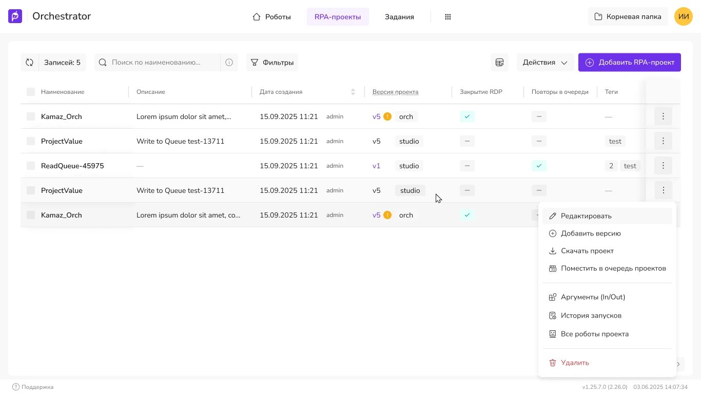
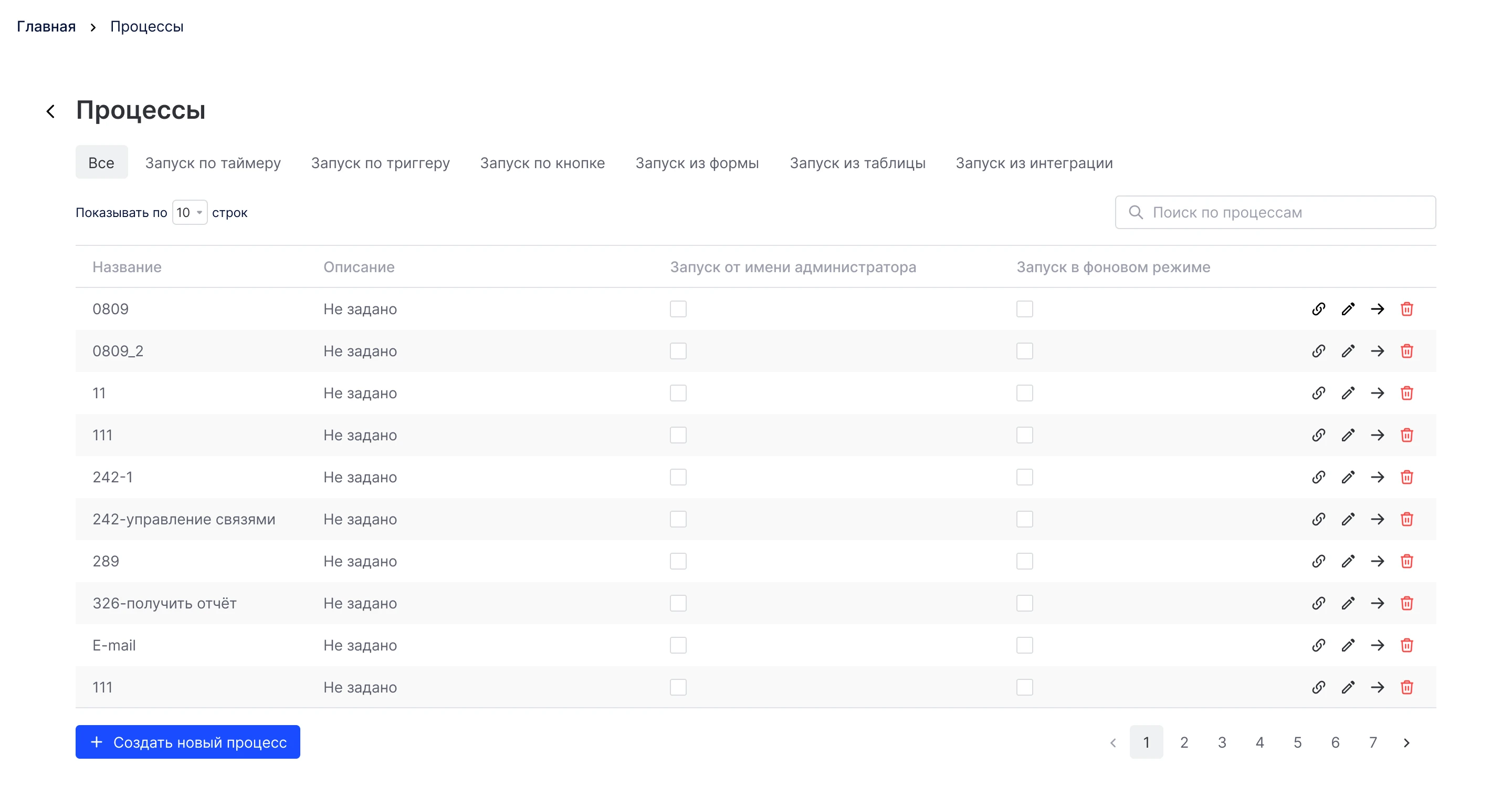
Web panel for automation orchestration
Primo RPA orchestrator web console: projects, launch and control of RPA bots. Redesign of key screens for production without halting releases.
Product Design · AI
A platform for intelligent document
processing and AI agent orchestration. Requests to the implementation team have dropped by 40%, and the time required to set up the first project has been reduced from ~3 days to ~4 hours.
The AI Server is deployed on the client’s internal servers. The product was actively tested, and the feedback revealed an unpleasant truth: only experts and the Primo RPA implementation team could configure it. Every new client consumed hours of technical support. The product was losing its appeal and didn’t scale well.
I started by getting to know the team and the configuration experts. I divided the scenarios into primary and secondary ones, created a visual representation of user behavior, and worked with the development team to identify areas where the interface could be simplified. I had already worked with AI and similar web platforms, so I quickly got up to speed on the subject matter and was able to speak the same language as the development team.
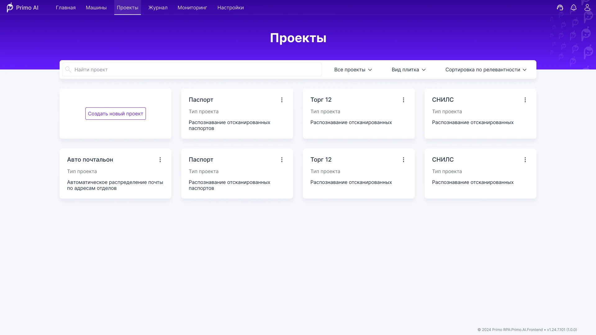
The service used a layout common to admin panels: a sidebar on the left, content on the right. Space was wasted, and when opening a project, navigation through its sections was intermixed with the main navigation. Users got lost.
I moved the main navigation to the top and condensed it. The content now has noticeably more space, while the layout remains familiar. Projects now have their own navigation that doesn’t overlap with the main navigation.



This is where users spend most of their time. Annotating fields on hundreds of images is monotonous work, but the quality of the data used to train the model depends on it. The previous editor didn’t fit the overall style, looked cluttered, and made working with fields confusing.
I broke the editor down into microscenarios, organized them by priority and interdependencies. Together with the team, we designed a smoother and more intuitive user experience, reserved space for future features, and aligned the design with the service’s overall style.
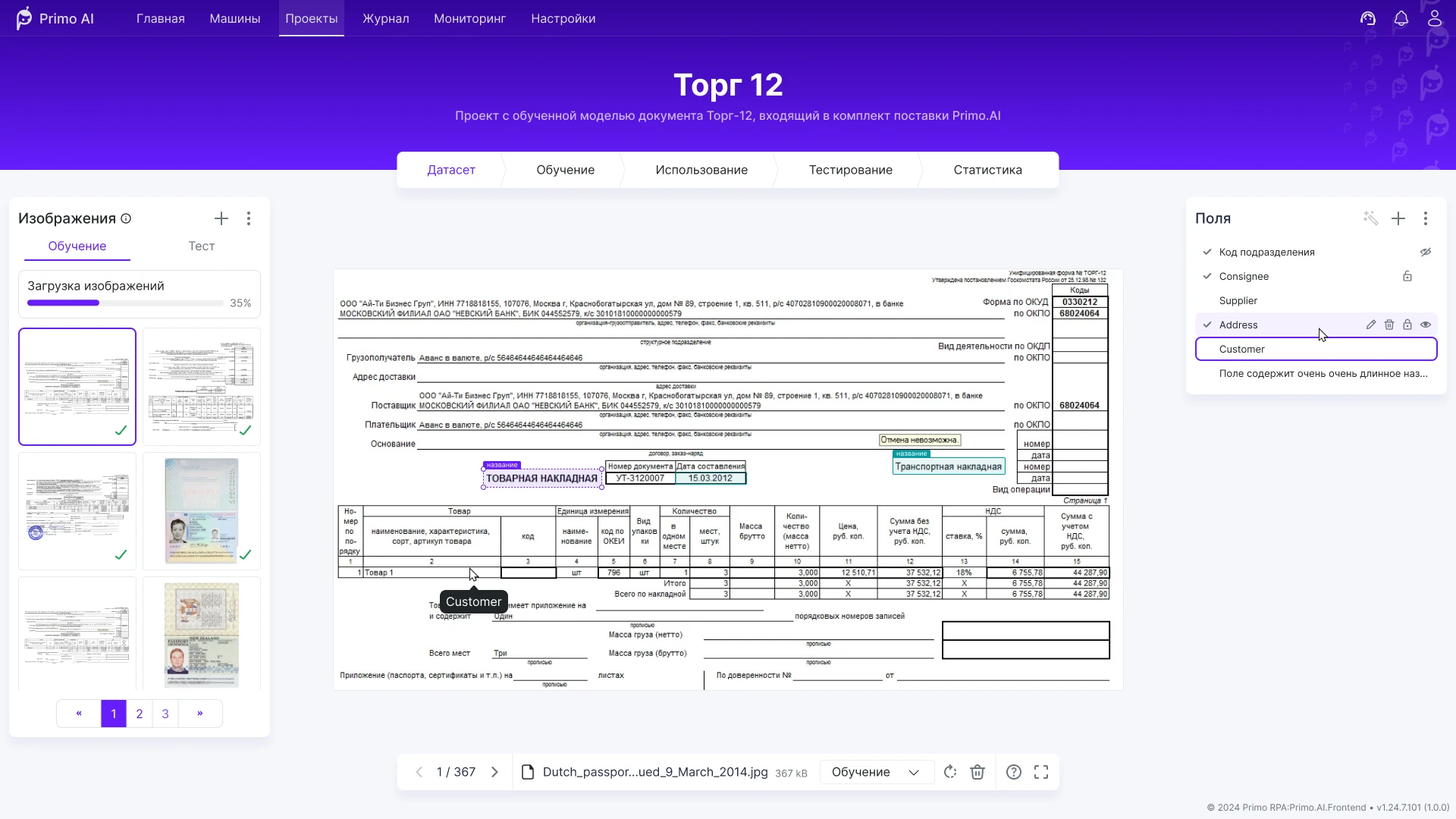
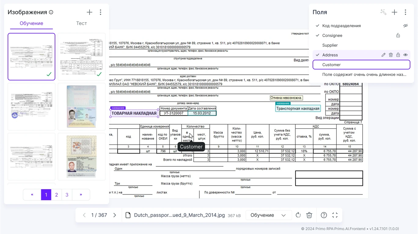
The page became symmetrical. Almost all the space is devoted to the image being annotated, and actions are grouped by panels: the desired function can be found quickly.

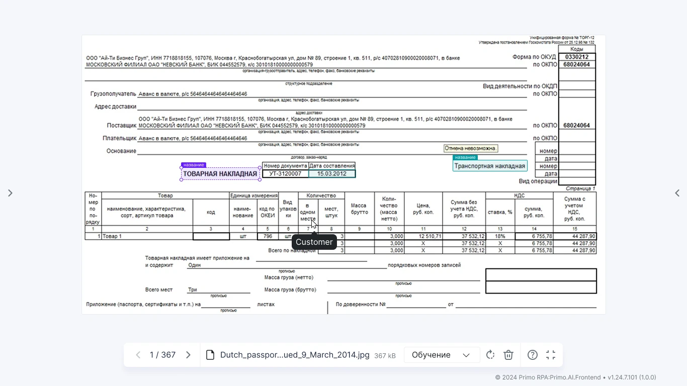
For advanced users, I’ve added a “Full Screen” mode. The side panels collapse, and you work using keyboard shortcuts and the bottom panel. This is a lifesaver on small monitors.


Related task: Configure unique field settings for the dataset. A large area is needed for the document scan, with dozens of fields, each having its own types and dependent settings.
The interface turned out to be compact. The mechanics aren’t immediately obvious at first glance, but after a short learning curve, working with it becomes quick and comfortable.
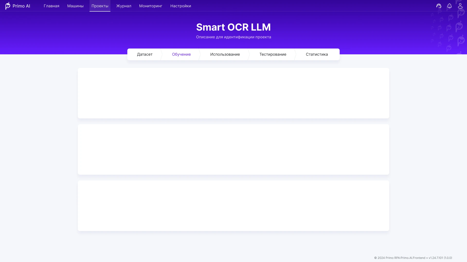
After annotating the dataset, the model undergoes fine-tuning. We analyzed all user actions and explored several page layouts. We settled on a card feed.
At the beginning of the feed is a configuration card: the annotation results for the active dataset, parameters, and the option to start fine-tuning.
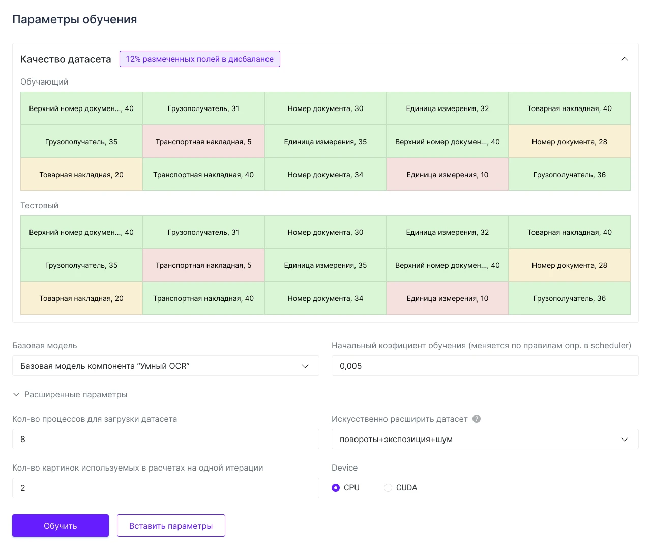
A separate card appears for each running process. You can start multiple processes with different parameters and compare which configuration performed better.
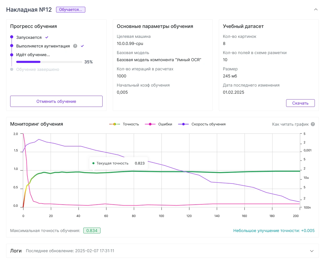

Cards can be collapsed; the title and status remain visible in the header.

Patterns from these cards were later applied to other sections of the product. It became easier to maintain a consistent style.
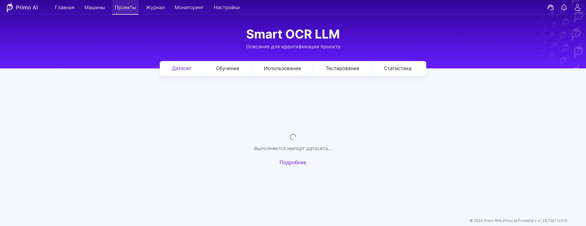
Some tasks run in parallel with other work. For such scenarios, a modal window opens on a separate page.
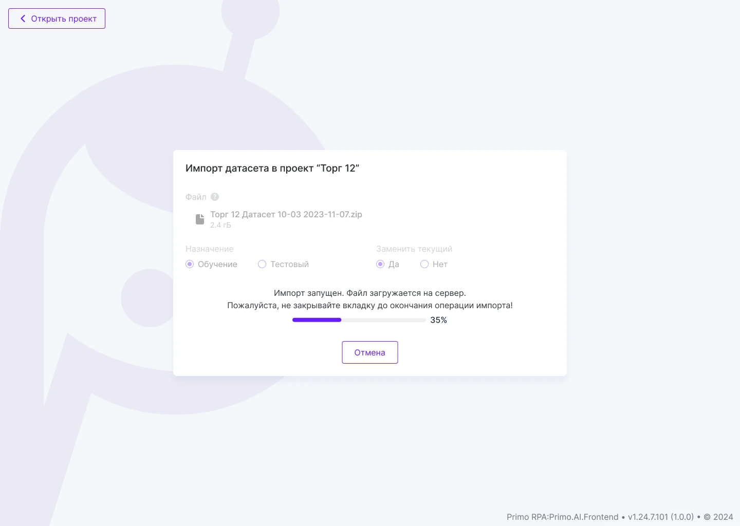
Meanwhile, a placeholder with a button to navigate to the process remains on the project page.
Once a week, we discussed the design with the team: the task list, priorities, and deadlines aligned with release plans. I went over the details of the mockups one-on-one with the front-end developer and provided feedback after the layout was completed to ensure the result matched the intended behavior.
An interface for training and using AI models in business processes: working with data, automation scenarios, and Smart OCR.
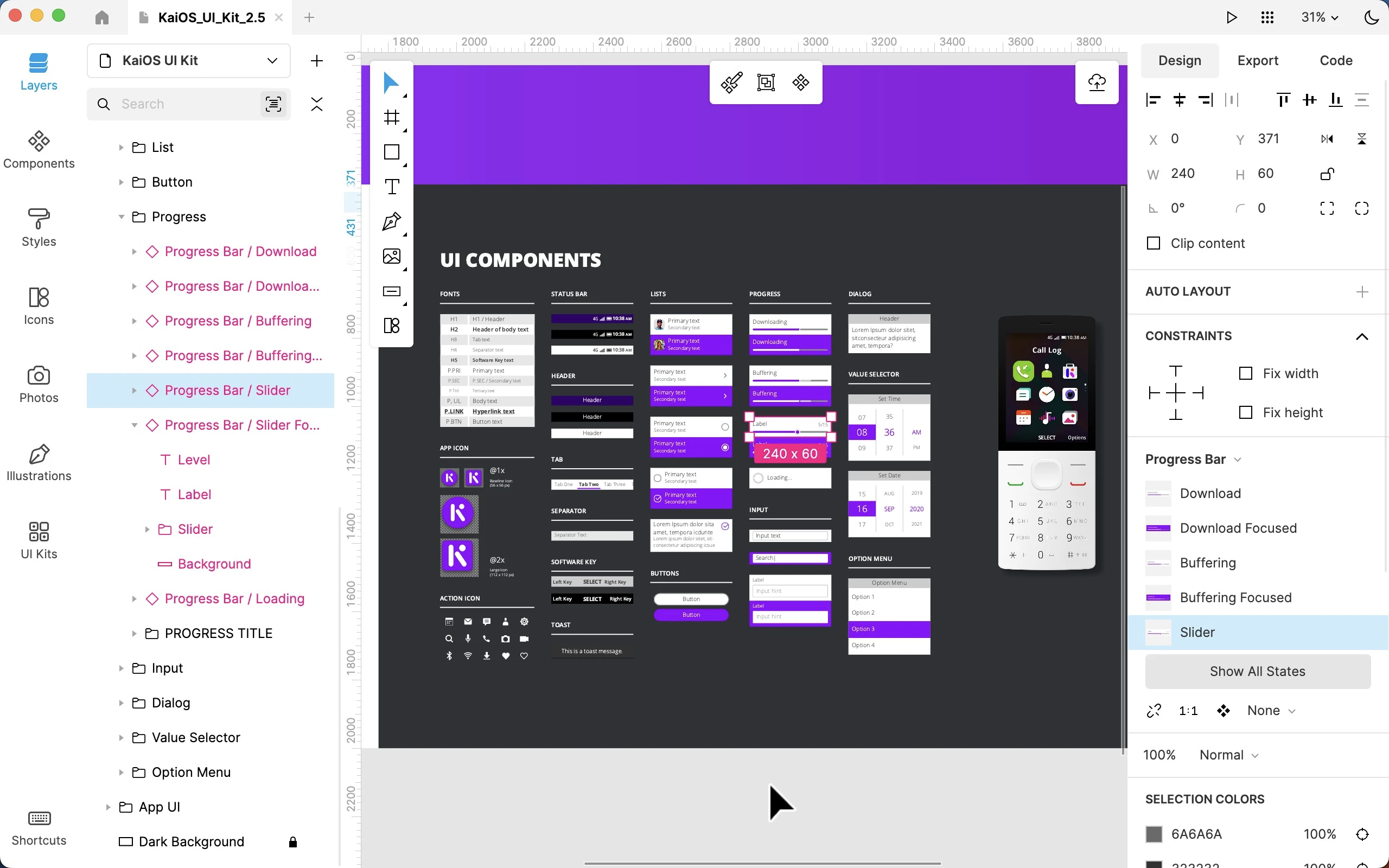
Worked on the Lunacy interface as part of the Icons8 team: user flow, complex prototypes, and improvements to functionality and interface logic.
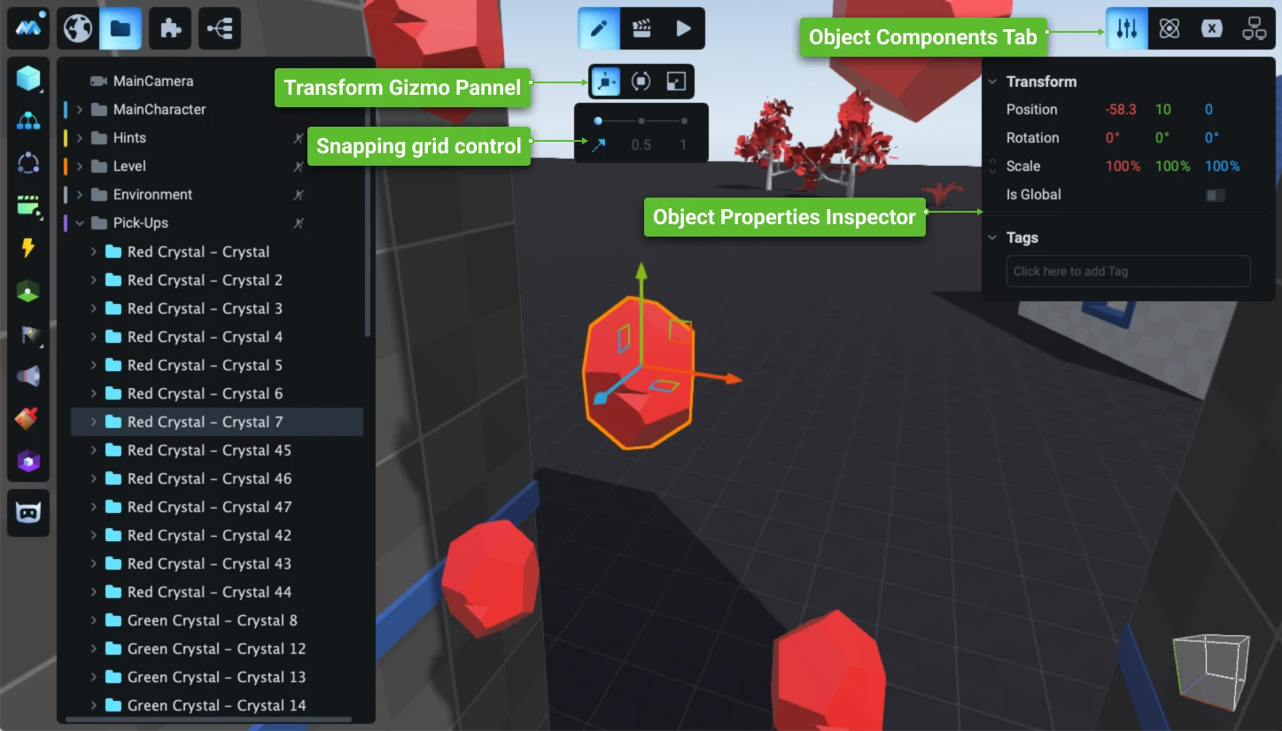
Redesign and development of the game engine’s user interface: a new operational concept, an updated visual system, and the development of hundreds of complex user scenarios.
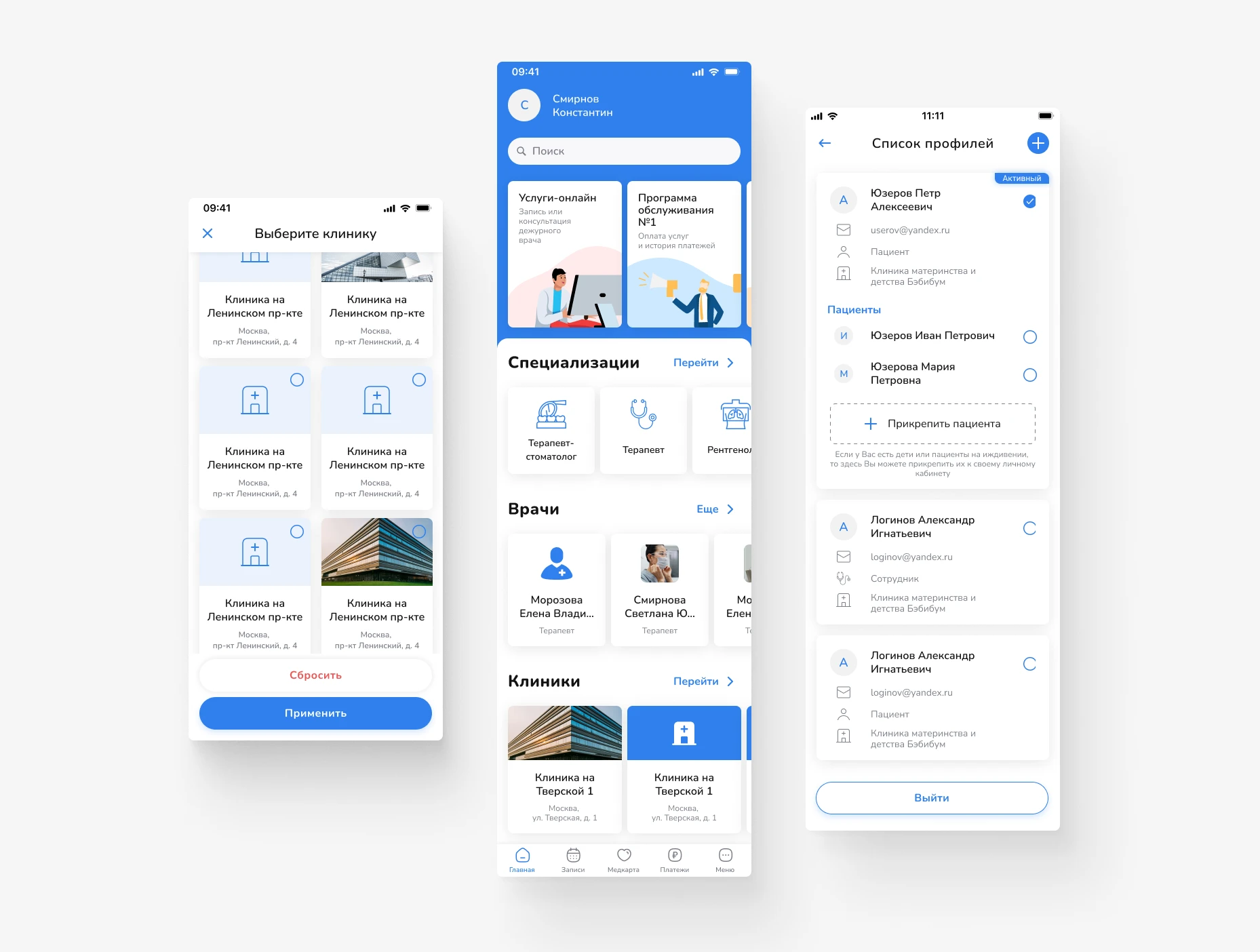
Design of a mobile app for scheduling doctor appointments and managing medical services. Focus on a simple user journey, intuitive navigation, and quick access to necessary actions.
Primo RPA orchestrator’s web dashboard: projects, deployment, and monitoring of RPA robots. Redesign of key screens for production without interrupting releases.
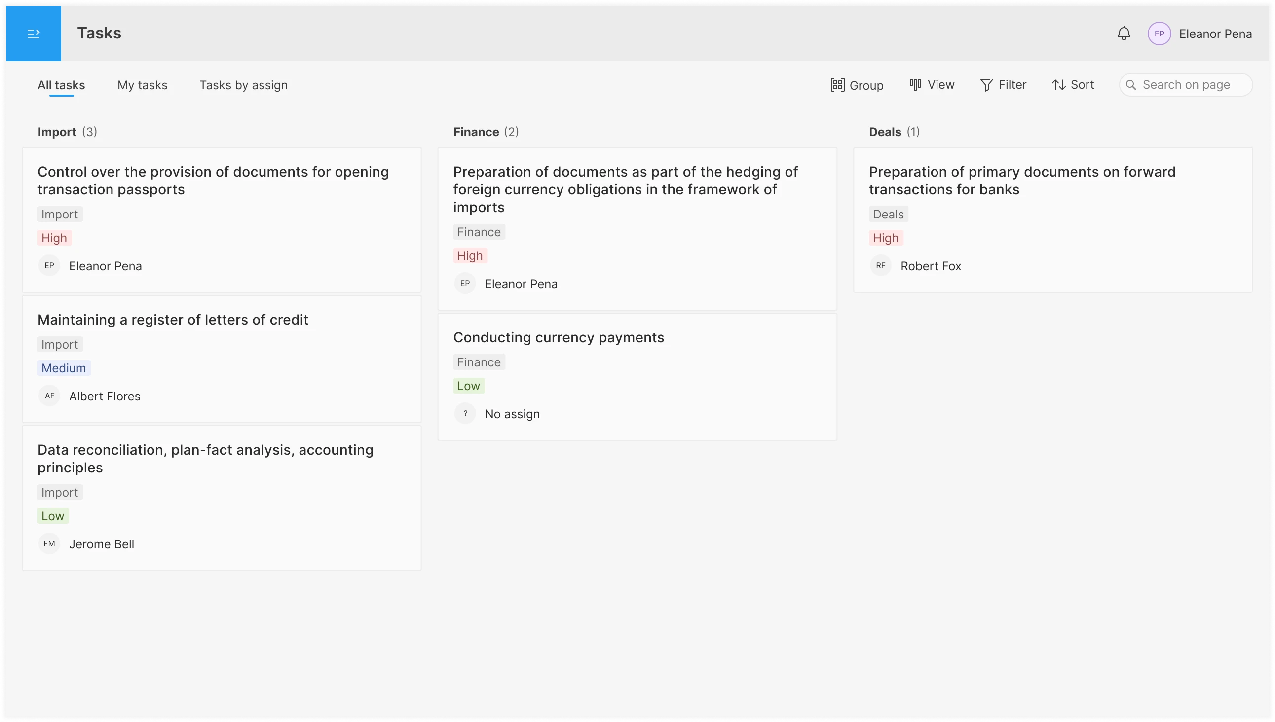
Product concept for a service to create, assign, and track tasks, with an emphasis on process transparency and seamless teamwork.
An interface for planning and assigning tasks in the operations department: shared pool, personal to-do list, overview by assignee; tabs, filters, board/list/table views, and drag-and-drop functionality.


