Web panel for automation orchestration
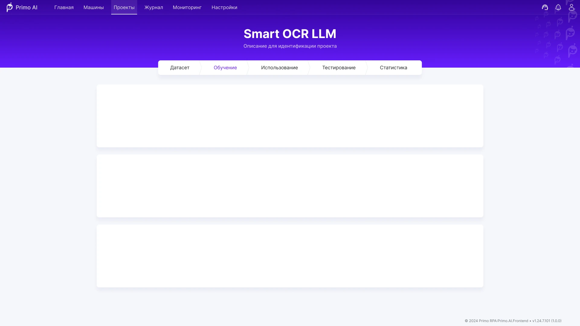
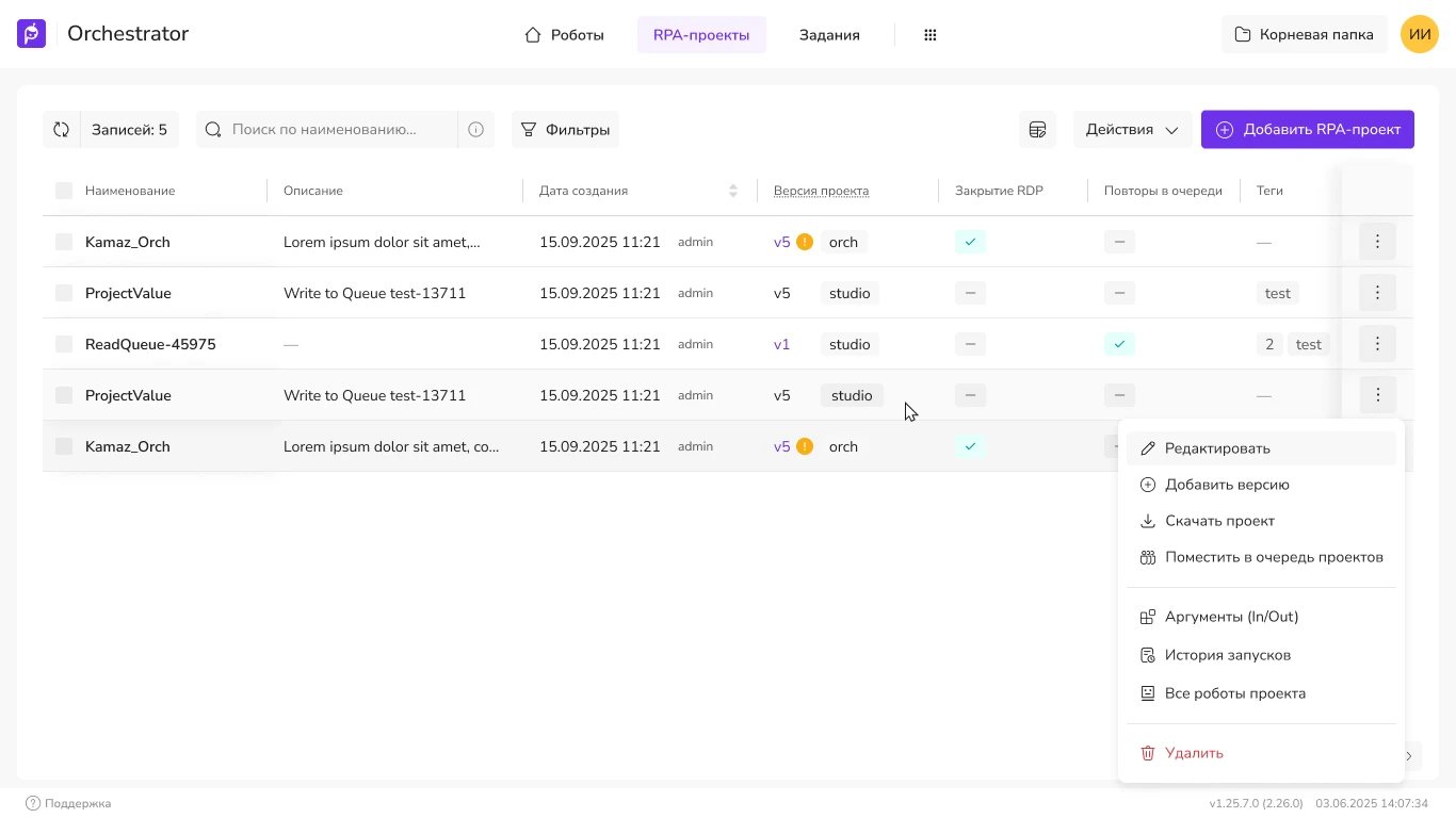
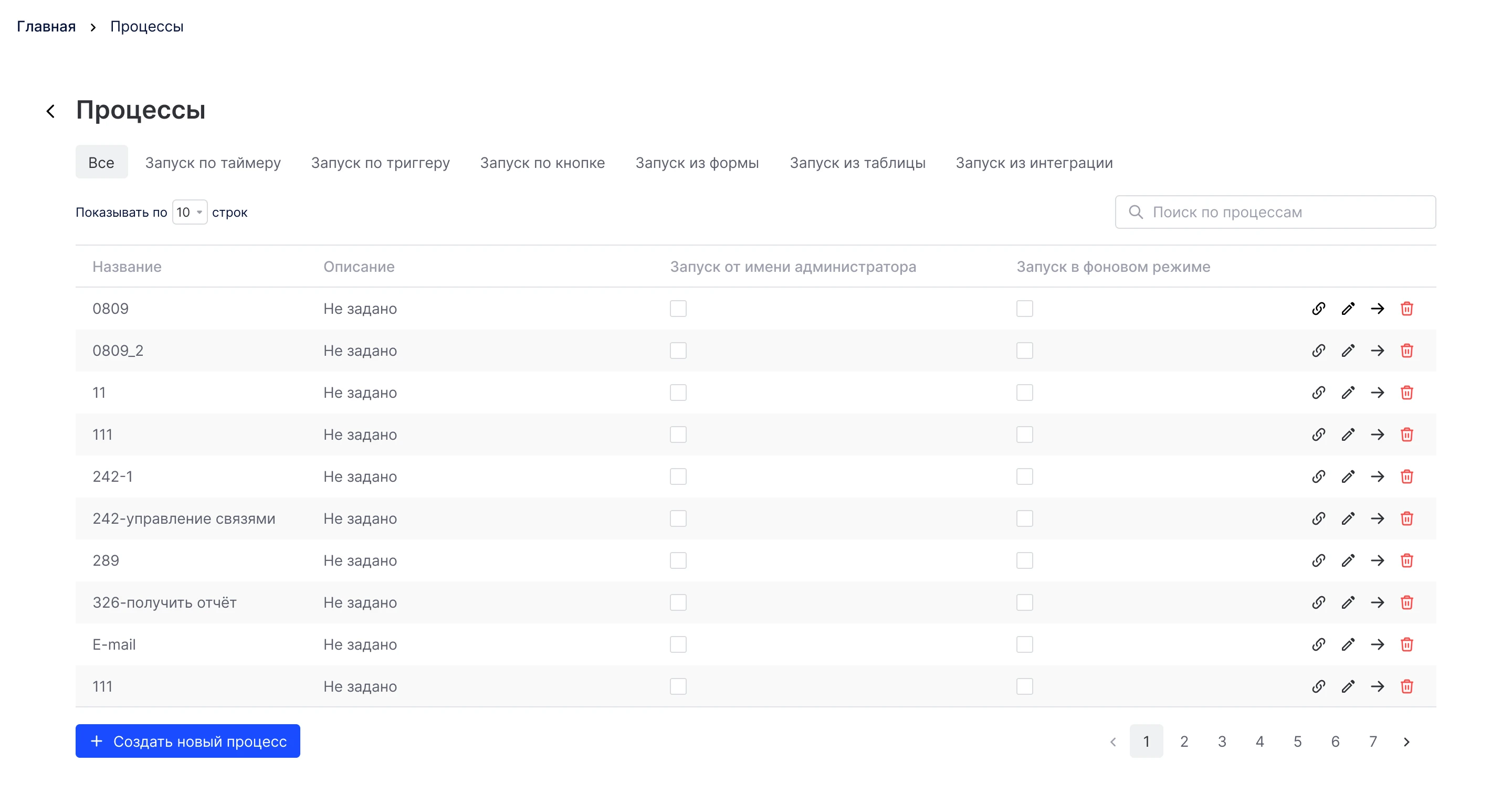
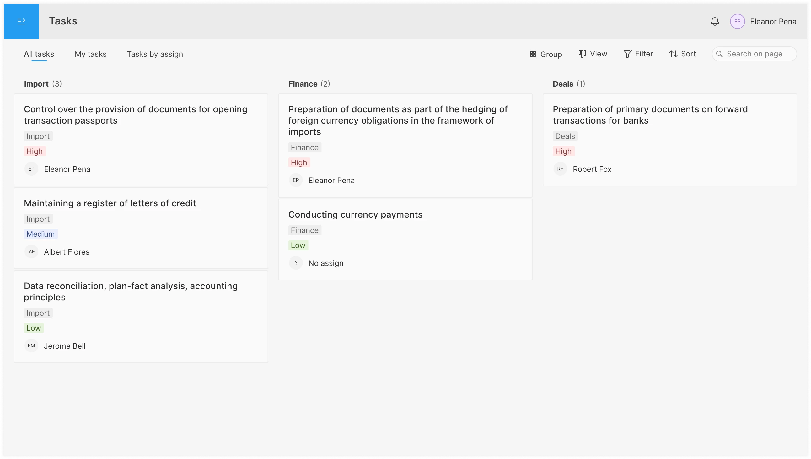
Primo RPA orchestrator web console: projects, launch and control of RPA bots. Redesign of key screens for production without halting releases.
Test Assignment · Back Office
Implement an interface for planning and assigning tasks to employees in the operations department who work in a back-office system. There are a large number of diverse tasks that can be grouped into the following categories: Type-1, Type-2, Type-3, Type-4, Type-5, Type-6, Type-7. Each task has its own automatically assigned priority. Users have access only to tasks from specific categories.
The following needs to be implemented:
Since I personally have extensive experience working with task trackers, I’m drawing on my own experience and that of my colleagues, while taking the project requirements into account.
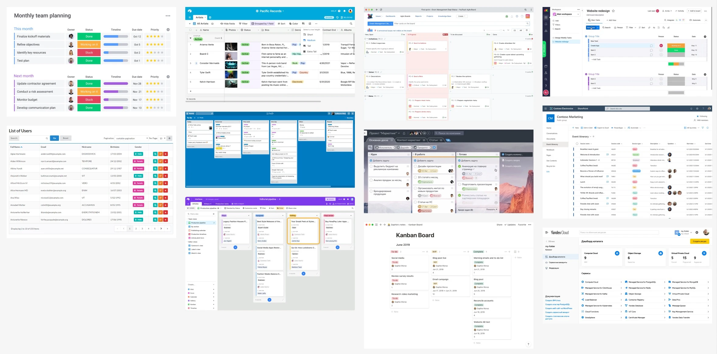
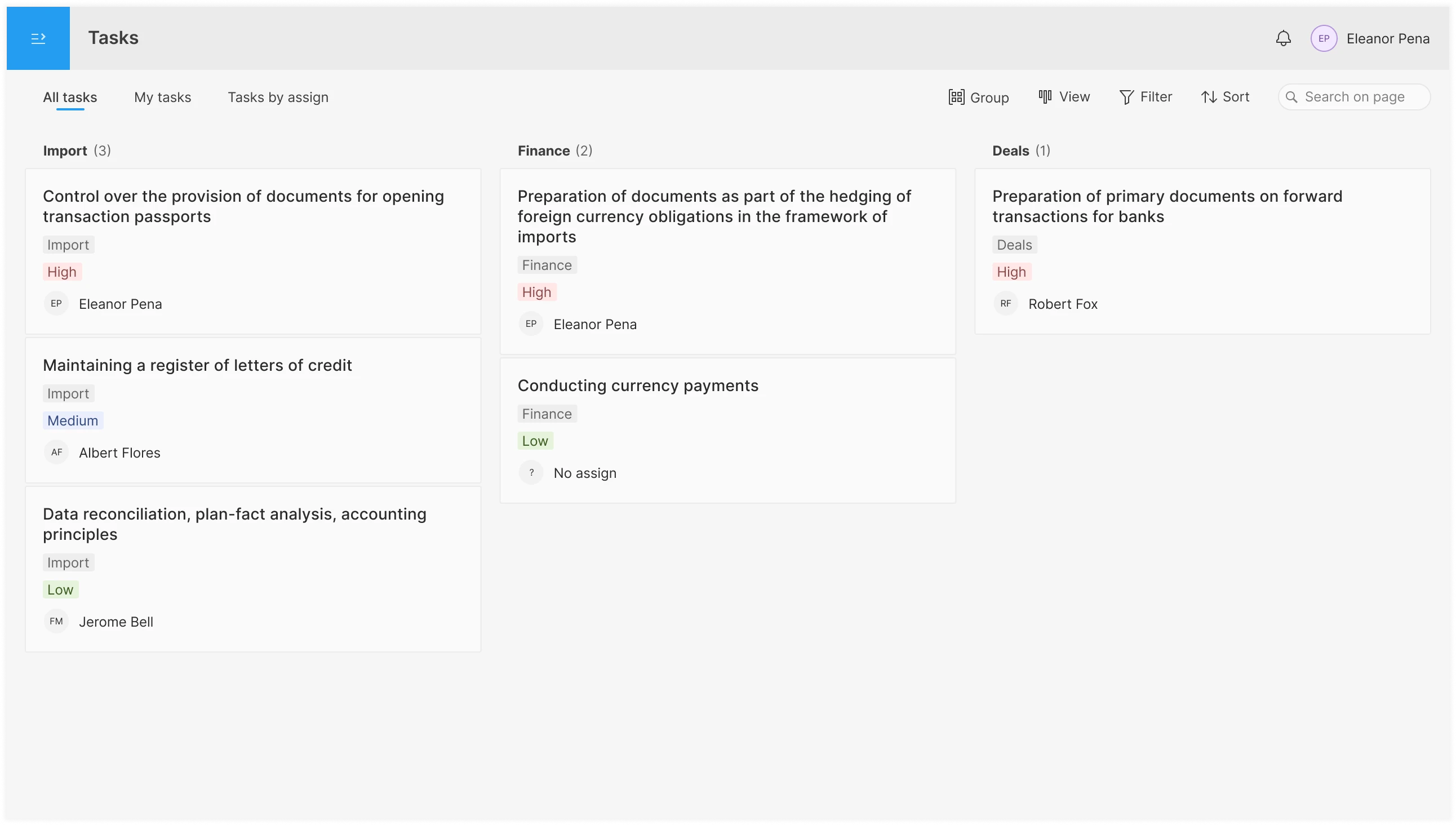
On the All Tasks tab, the employee can view all available tasks.
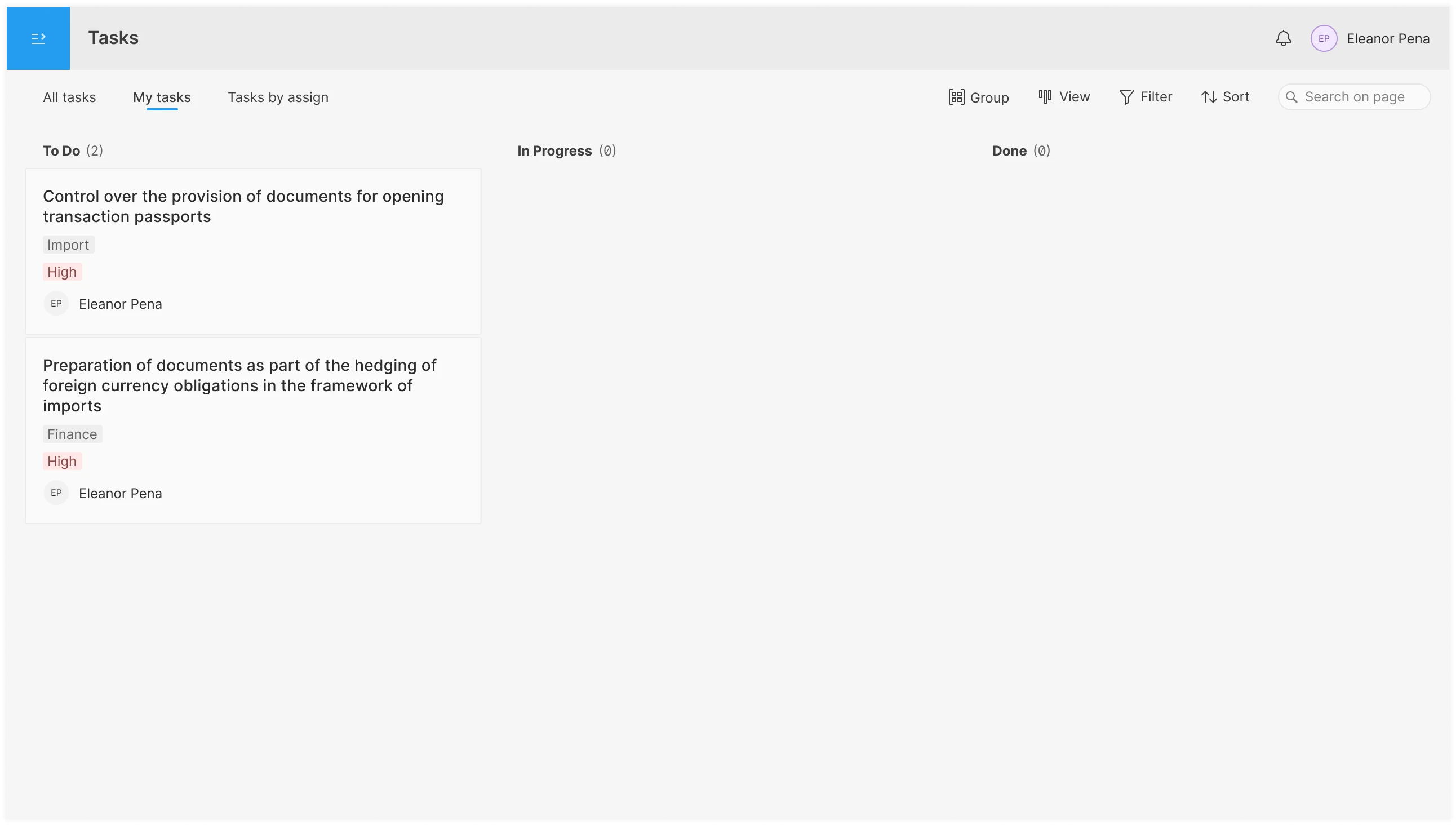
The "My tasks" tab displays only those tasks assigned to the current employee. Tasks are grouped by status (the status is hidden in the task card).
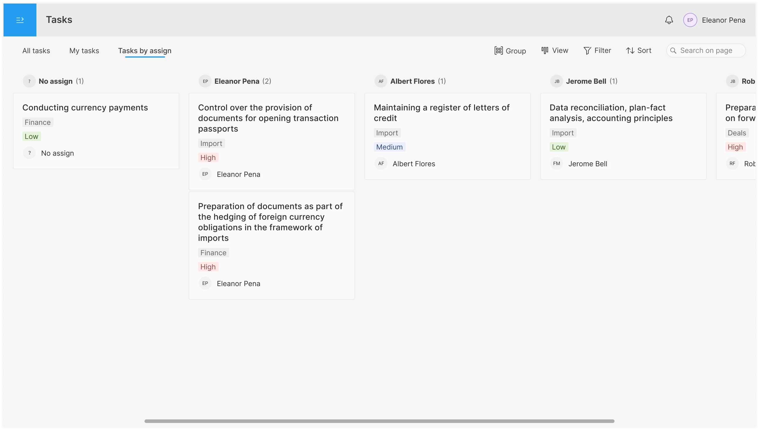
The “Task by Assignee” tab displays all tasks broken down by assignee.
Options for the current tab are located on the right-hand side.

All changes are saved when you leave the tab and when you close the entire Tasks page. These settings are individual, and each employee can customize the page as they see fit.
The page uses lazy loading for tasks. As you scroll down, new tasks will load. The number of tasks is displayed in the headers; this can be helpful for estimating how far you need to scroll to see everything. There may be a large number of tasks, in which case it might make sense to add pagination as well.
Different views of the same tasks can be useful for various contexts in which the Tasks page is used, as well as to accommodate employees’ personal preferences, which increases their efficiency. An employee who isn’t annoyed by the interface works more productively and contributes more.
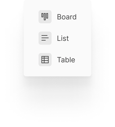
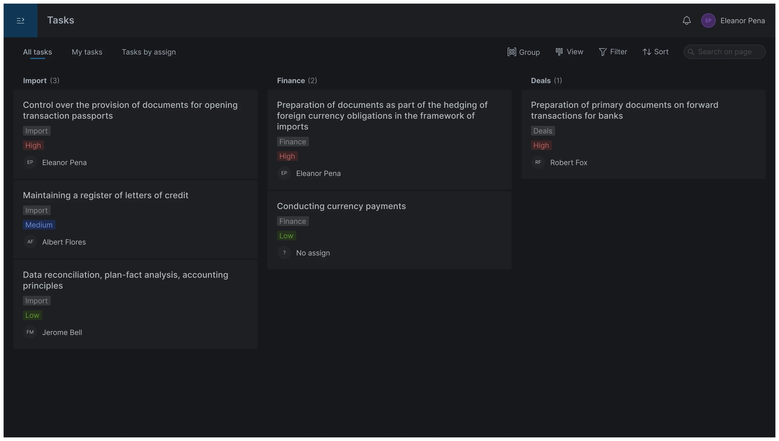
The Board view makes it easier to use the drag-and-drop feature (see below). It’s also visually easier to determine the number of tasks in a category, which I imagine could be helpful. When tasks are grouped by completion status, moving cards from left to right creates a natural horizontal flow of tasks from point A to point B.
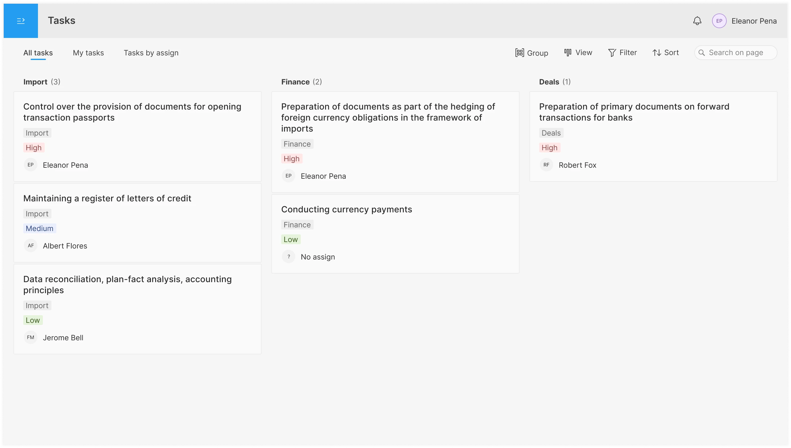
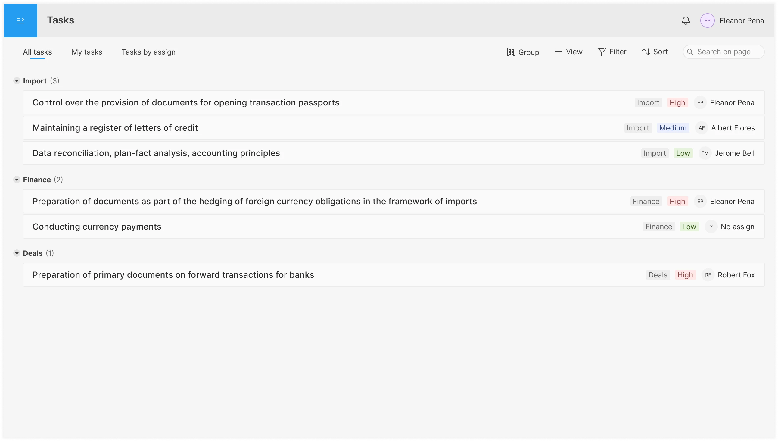
The List view allows you to see more information in a smaller screen area. At the same time, this view is visually and functionally simpler than the table view, which means less cognitive load on the user. Also, all task titles start at the far left, making it easy to scan the list.
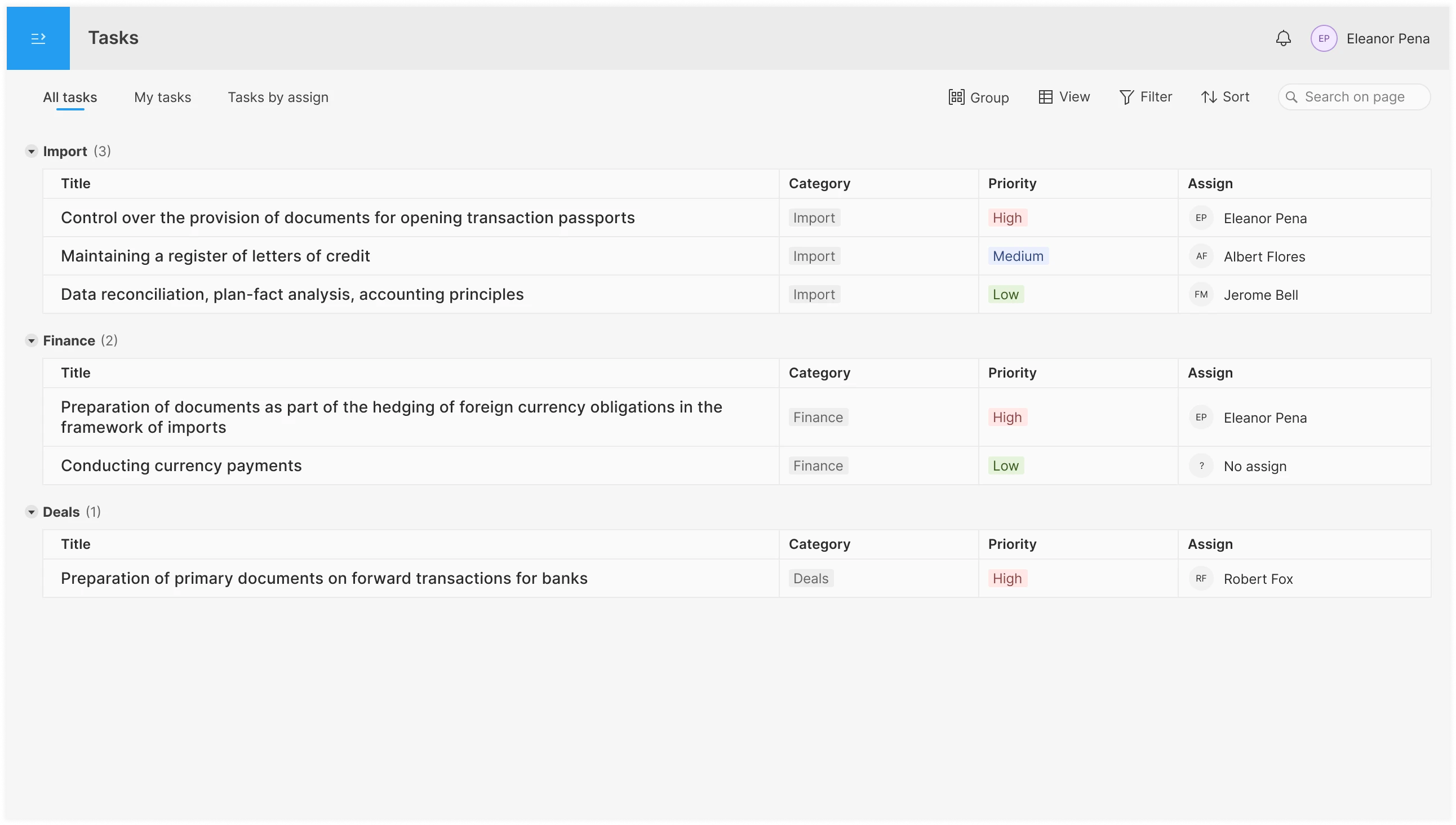
The Table view allows you to work with all task fields immediately, without having to open the task in a modal window or a separate page. The table allows you to customize the width and order of columns, which can be convenient in certain use cases.
In all views, you can drag and drop elements (cards, list items, and table rows and columns). This promotes more productive work and feels natural to the user. For example, if you need to distribute tasks among employees (for an admin or manager), change the status of multiple tasks at once, or do so within a short period of time.
Board view
List view
Advanced interactive prototype in ProtoPie
A schematic representation of how Drag & Drop works. This type of prototype helps designers better understand the nuances that need to be considered in the user flow, as well as when preparing specifications for developers. Also, by testing this prototype, you may realize that the feature needs to work completely differently and decide to redesign it right away. This saves overall development time.
In the prototype, only the blue card can be moved, and not all positions work correctly. You can view the recording, which is available on the same prototype page.
The visual style can be anything you like without changing the framework itself. For example, it could be a bit more colorful with more expressive fonts.
Light-colored theme
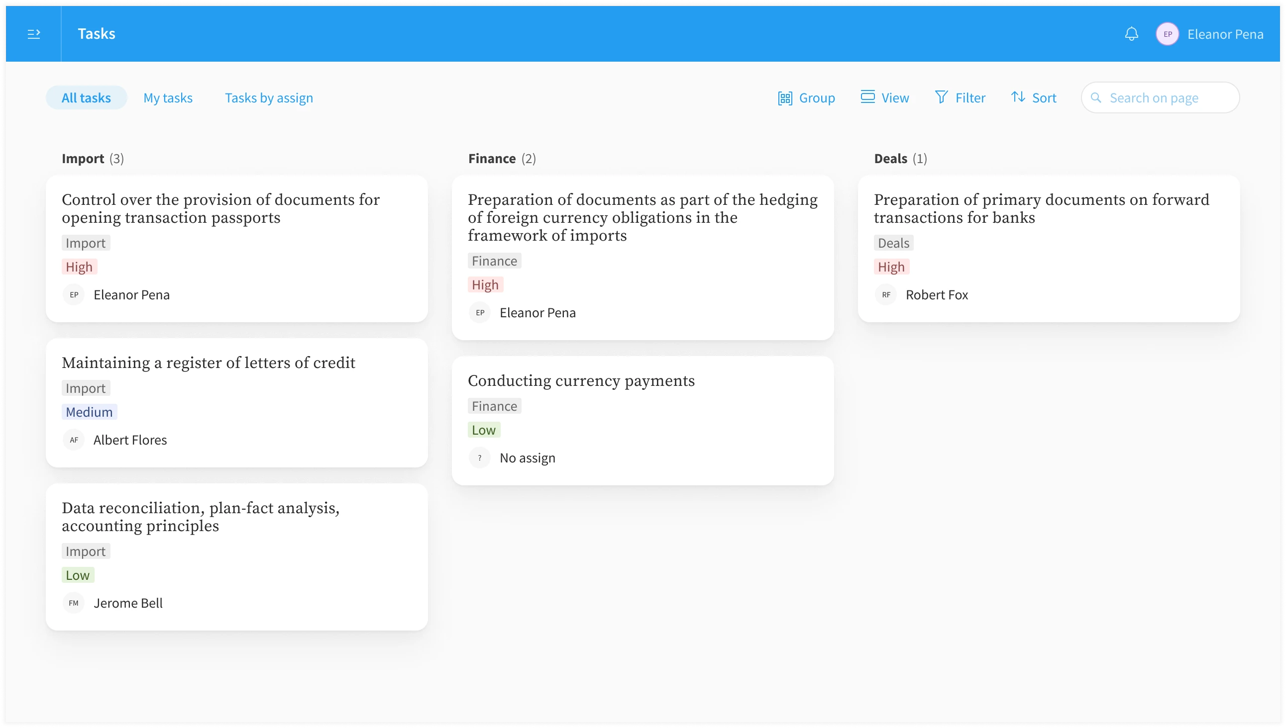
Neutral dark theme
During the Figma prototyping phase, you can conduct interviews with several employees—for example, 5 people. First, add real tasks from the current system to the prototype; about 20 should be enough. Next, you can hold a video call with the respondent’s screen shared or meet in person to present a few tasks and ask some questions. During the session, the respondent can interact with the prototype, but if something doesn’t work, the interviewer can note the attempt and explain that this feature isn’t working yet, as well as ask what the respondent expects to see next.
To assess the relevance of the implemented features, the following metrics must be collected.
page_views_tasks with the option to break them down
all_tasks_tabmy_tasks_tabtasks_by_assignadminmanagerusersearch usedcustom_settings with the option to group
all_tasks_tabmy_tasks_tabtasks_by_assignadminmanagerusergroupfiltersortview_used with the option to break down
all_tasks_tabmy_tasks_tabtasks_by_assignadminmanageruserThen, over the next six months (or sooner, depending on user activity), we’ll be able to see the results and conduct a study (in the form of interviews) on the features that are used least frequently and those that have received complaints, in order to gather high-quality data and get a complete picture of what’s happening.
When creating mockups in Figma, the following were used: auto-layout features; interactive components; plugins (Iconify, Fitter, Protofly, Shadow Maker, Dark Side, etc.); and the Community file (+40 Types of Cursor). About 60% of the layers are named and organized for easier workflow. An 8pt grid is used, with additional sizes of 2pt and 4pt. Color styles are available for light and dark themes. The design adapts to changing window sizes (no mobile version).
An interface for training and using AI models in business processes: working with data, automation scenarios, and Smart OCR.
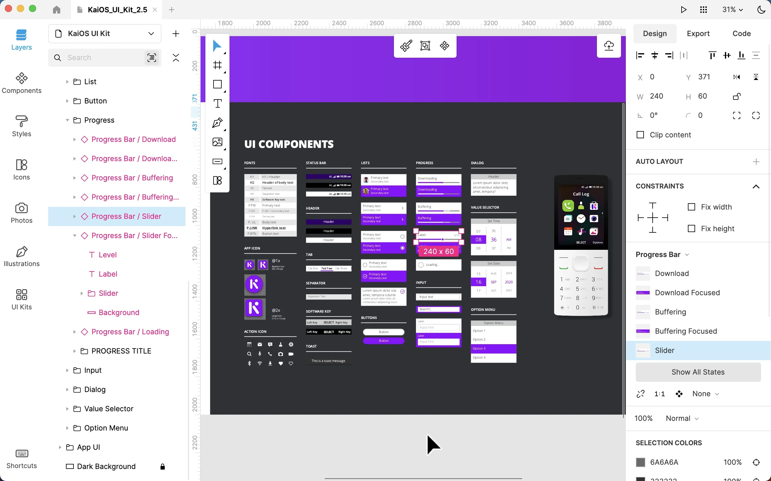
Worked on the Lunacy interface as part of the Icons8 team: user flow, complex prototypes, and improvements to functionality and interface logic.
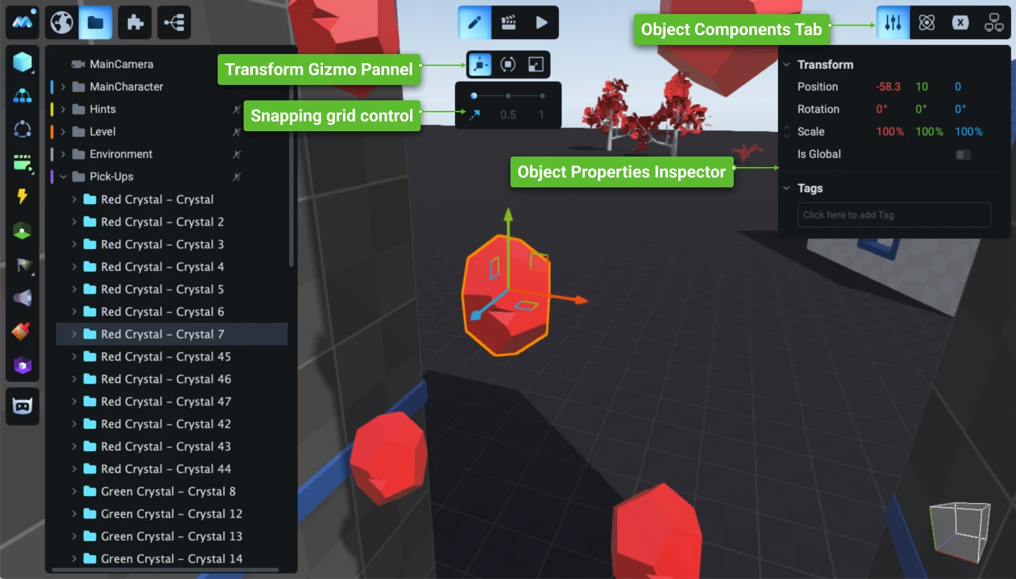
Redesign and development of the game engine’s user interface: a new operational concept, an updated visual system, and the development of hundreds of complex user scenarios.
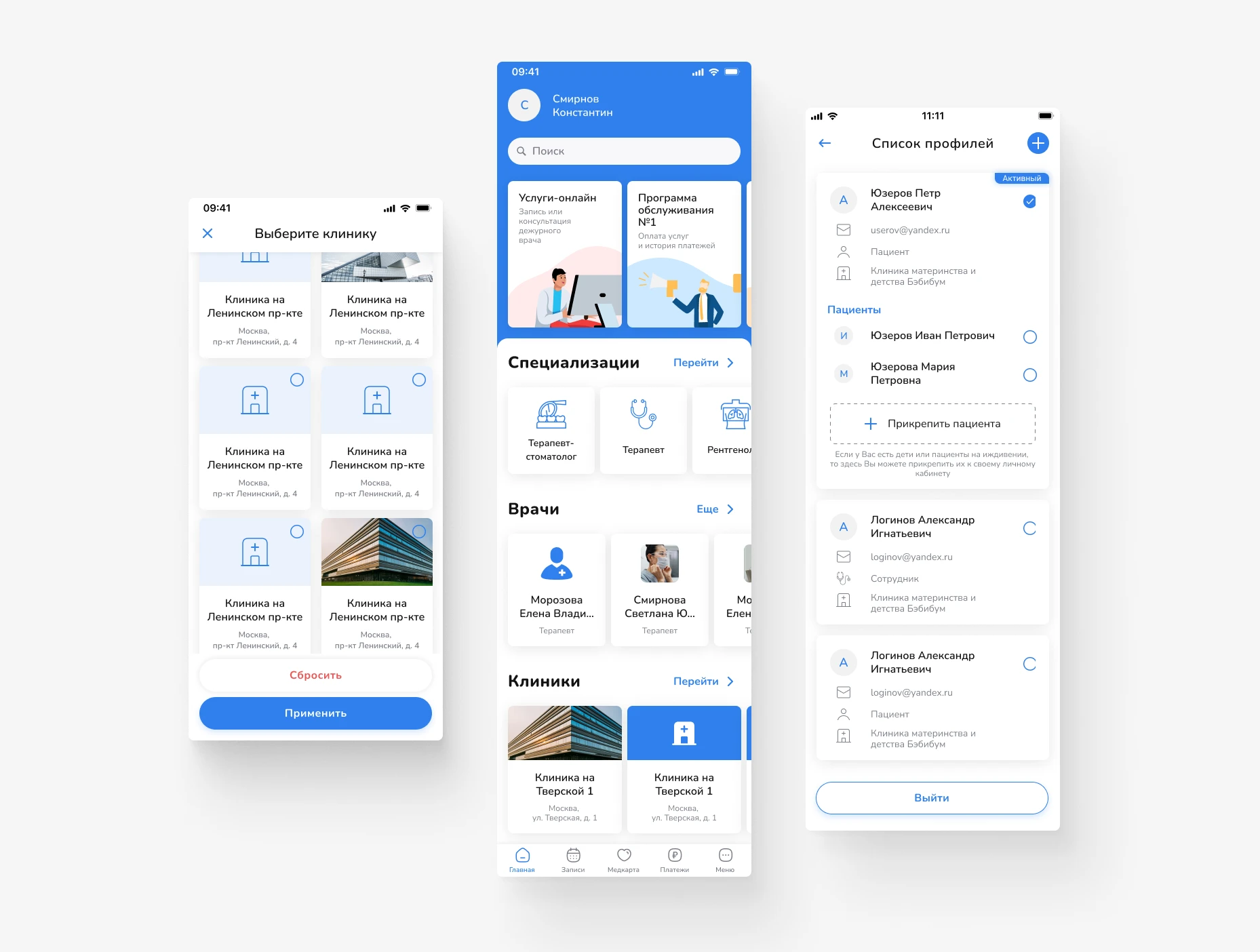
Design of a mobile app for scheduling doctor appointments and managing medical services. Focus on a simple user journey, intuitive navigation, and quick access to necessary actions.
Primo RPA orchestrator’s web dashboard: projects, deployment, and monitoring of RPA robots. Redesign of key screens for production without interrupting releases.
Product concept for a service to create, assign, and track tasks, with an emphasis on process transparency and seamless teamwork.
An interface for planning and assigning tasks in the operations department: shared pool, personal to-do list, overview by assignee; tabs, filters, board/list/table views, and drag-and-drop functionality.


