Web panel for automation orchestration
Primo RPA orchestrator web console: projects, launch and control of RPA bots. Redesign of key screens for production without halting releases.
Primo RPA · UX/UI · Web App
Primo RPA Orchestrator: launching robots, managing projects, and monitoring processes in a web dashboard for administrators and automation developers.
In the Primo RPA stack, the orchestrator manages the scheduling, queue, and statuses of RPA robots on the client’s infrastructure. It can be accessed not only from the development studio but also from a browser: users view projects, restart tasks, and troubleshoot failures.
By that point, the product was already in use, but the interface was noticeably outdated: users faced navigation issues, visual clutter in tables, and confusing workflows in some sections. The goal was to refresh the interface’s look, modernize it, and fix the accumulated UX issues.
My role in this project was more of a curatorial one—I didn’t do the design myself, but rather structured the process so that the design and development teams could work in sync.
At the same time, I was looking for a designer who could take on the main visual design work. Elizaveta was selected—out of more than 150 applications, she was the best fit for the upcoming workload.
Over the course of three months, I brought the new team member up to speed on the project details: I assigned tasks, provided feedback on the mockups she created, and shared context on user scenarios. Together with the development team, we planned the order in which to update the service’s design—we revised screens based on priority, incorporating changes into ongoing releases, without “stopping everything and redesigning from scratch.”
The latest version of Ant Design was chosen as the UI framework. It was already in use on the project, and its latest release introduced the Theme Editor—a feature that allowed us to customize the appearance of components using design tokens without manually overriding styles. This provided both designers and developers with a unified language for describing the user interface.
Storybook served as the single source of truth and the bridge between design and development. In Storybook, components weren’t just documented—they actually worked in an isolated environment. This allowed designers to see the elements in action and developers to integrate components into the dashboard more quickly.
To streamline our workflow, we synchronized tokens from Ant Design with those in Figma—colors, padding, typography, and corner radii were standardized to consistent values. Here’s how it worked: if tokens were updated in Figma, they could be exported as JSON and immediately imported into the code without any issues—instead of having a developer manually search for changes and update each token individually. This approach also allowed us to view the design more systematically.
Components in Figma were built from scratch—based on Ant Design references, but without using pre-made libraries. The decision to avoid pre-made solutions was a conscious one: we needed full customization to fit our workflow and the ability to use new Figma features that weren’t supported in libraries from the Figma community.
For Storybook, we selected and configured plugins that were relevant to our tasks—accessibility checks, viewing component states, and switching themes and locales. This turned Storybook into more than just a showcase for components; it became a full-fledged design review tool.
We set up the environment so that designers could see the live implementation of components on their own computers using a local Storybook instance and Git. This allowed for more precise control over how the intended design was translated into code and enabled us to quickly spot discrepancies early on.
We also discussed a step to accelerate Storybook support by allowing designers to write the JSX for implemented components themselves—this shortened the path from mockup to a documented component in Storybook.
We fine-tuned the workflow for adding icons to the library. The key feature was that icons could be displayed in Storybook with filtering and sorting capabilities. At the same time, designers could update icons without involving a developer—they simply pushed new files to the repository.
Being able to see the updated icon immediately in the browser allowed us to optimize it better and eliminate display glitches when using Boolean operations.
We also developed an approach and set of rules for Figma that not only guided the designer but also ensured the creation of consistent and functional icons.
During the interface update, Elizaveta also proposed a number of user experience improvements. Some of them were successfully implemented—for example, clearer grouping of elements in complex forms and redesigned loading states. However, the priority was not to disrupt the existing UX that users had grown accustomed to, so many ideas were saved for the backlog for the next iteration.
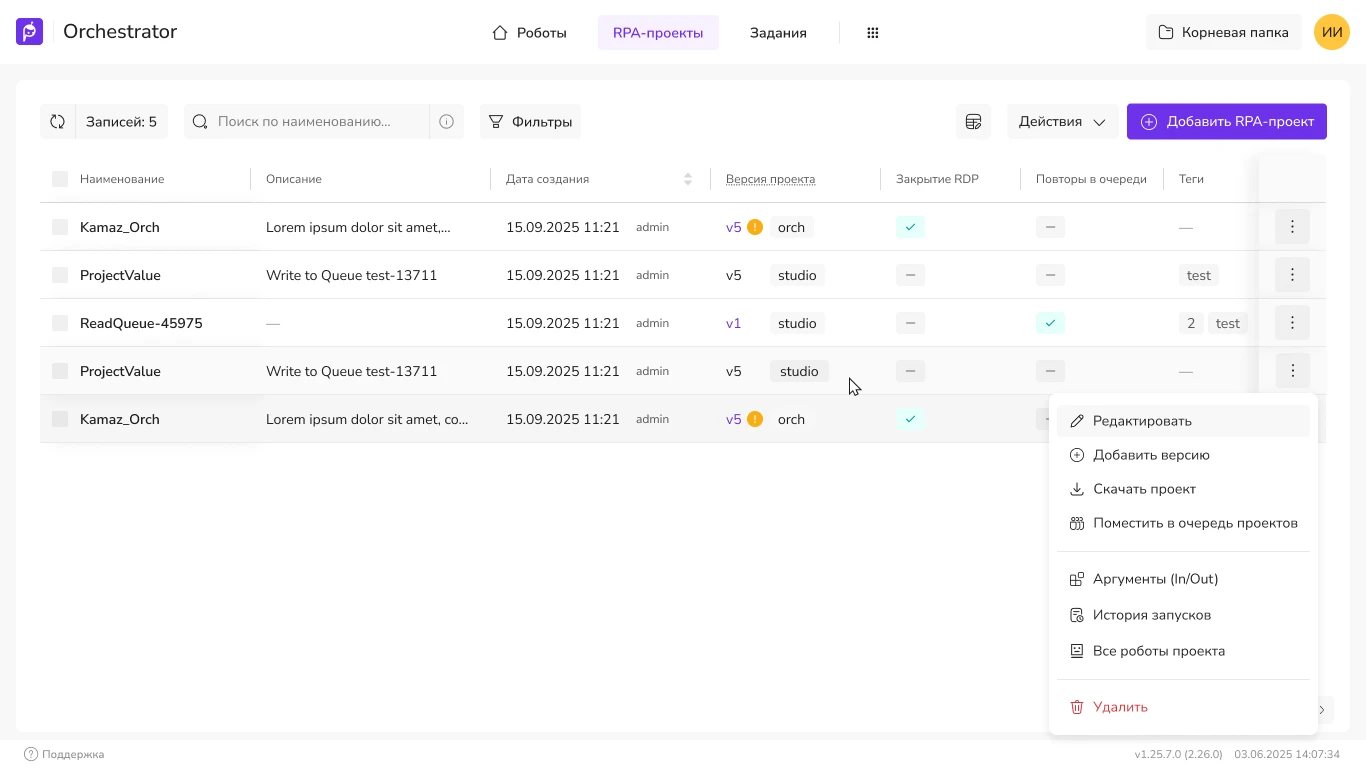
The project table is one of the most frequently viewed screens. In the old version, there were many columns, a dense grid, and small text: the project status and name were difficult to read, especially on a laptop.
In the new version:
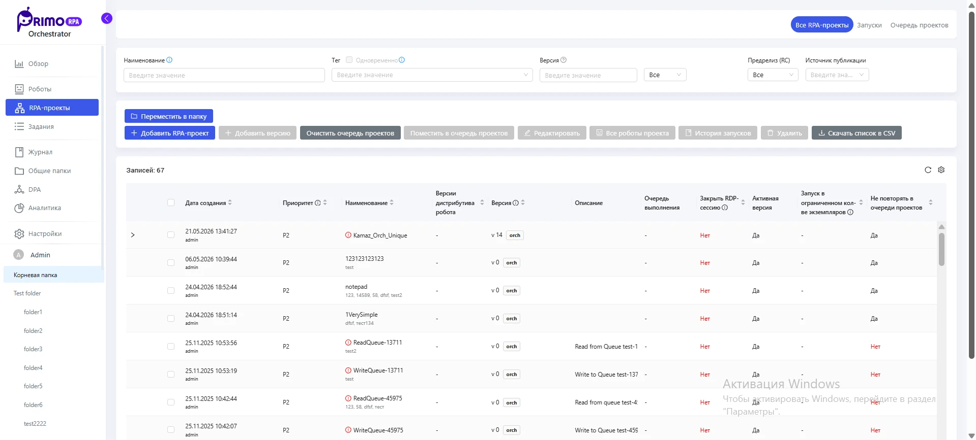
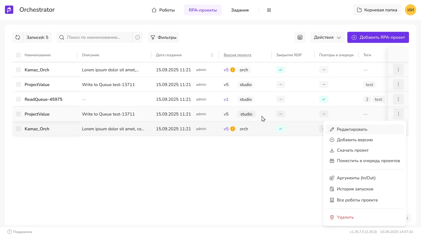
The projects screen became easier to scan: less visual noise, and it’s faster to find the right project and its status. After rolling out the new design to several clients, we received positive feedback and many ideas for further improvements.
I stepped away from the project once Elizaveta felt confident in her role and was able to handle design tasks independently. I occasionally answered specific questions, but overall, the handoff went smoothly.
A little over a year later, the team’s processes have changed significantly. According to the team, tools powered by neural networks—such as Claude Design—are now actively involved in the creation and handoff of designs. What we used to build manually using tokens, Storybook, and environment synchronization is now, to some extent, automated.
I believe the work was completed fairly quickly and to a high standard—amid constant changes in the market and within the company, we managed not only to update the interface but also to establish a sustainable process that continued to function even without my involvement.
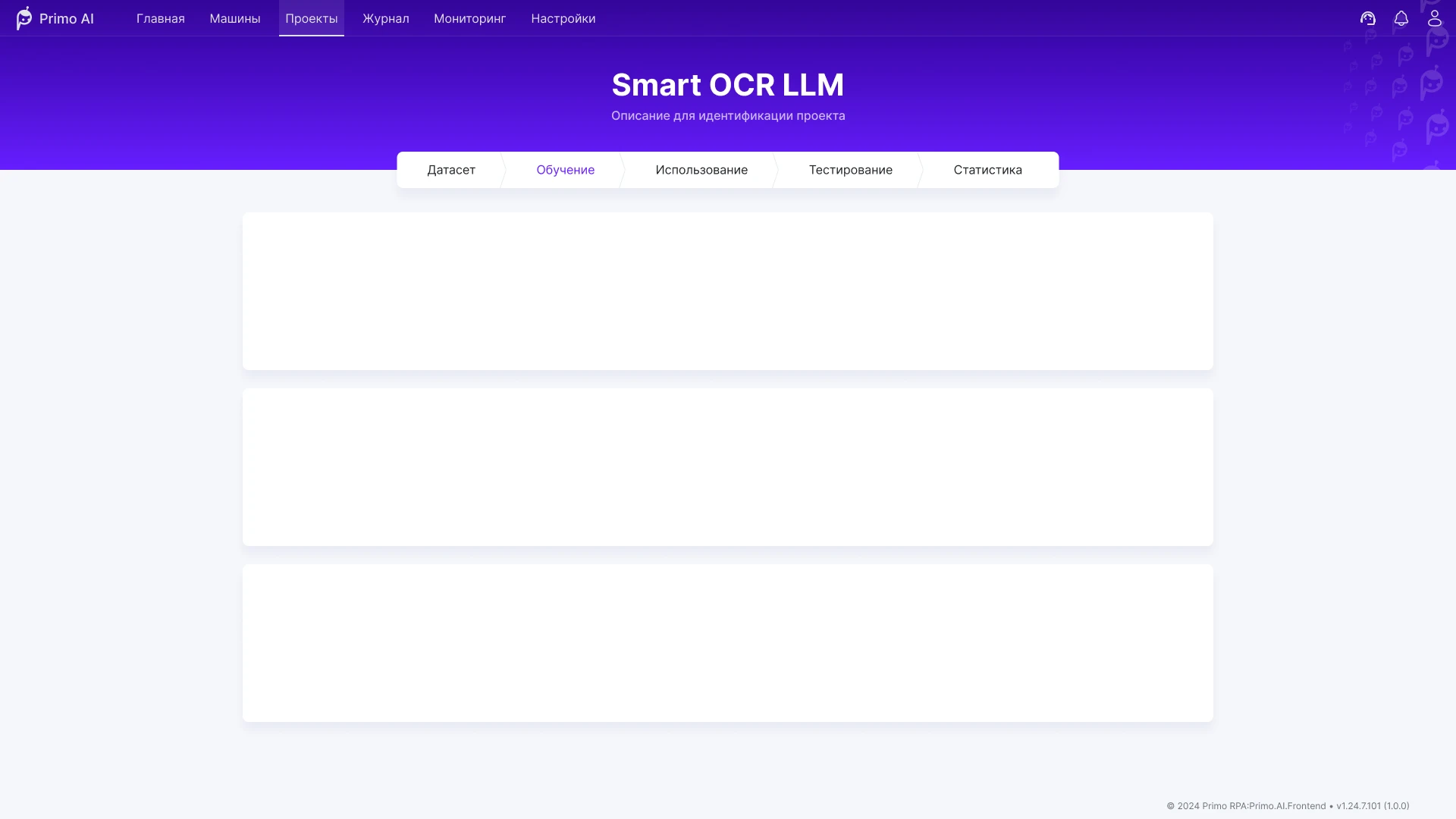
An interface for training and using AI models in business processes: working with data, automation scenarios, and Smart OCR.
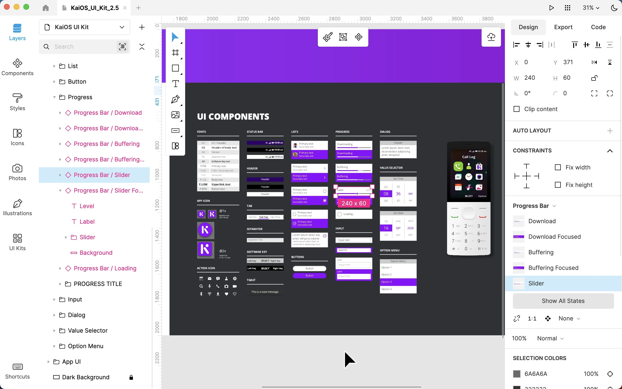
Worked on the Lunacy interface as part of the Icons8 team: user flow, complex prototypes, and improvements to functionality and interface logic.
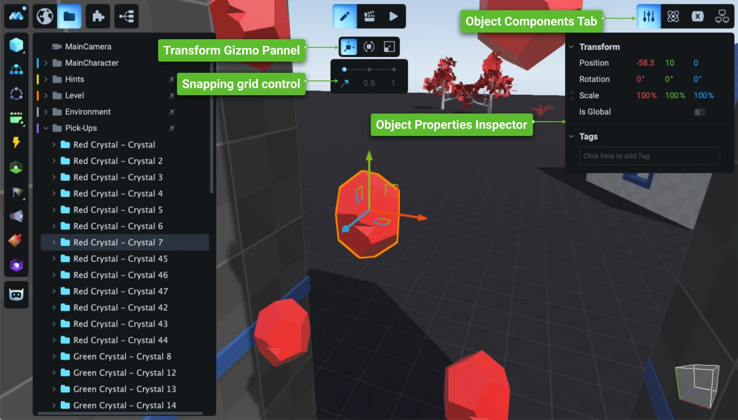
Redesign and development of the game engine’s user interface: a new operational concept, an updated visual system, and the development of hundreds of complex user scenarios.
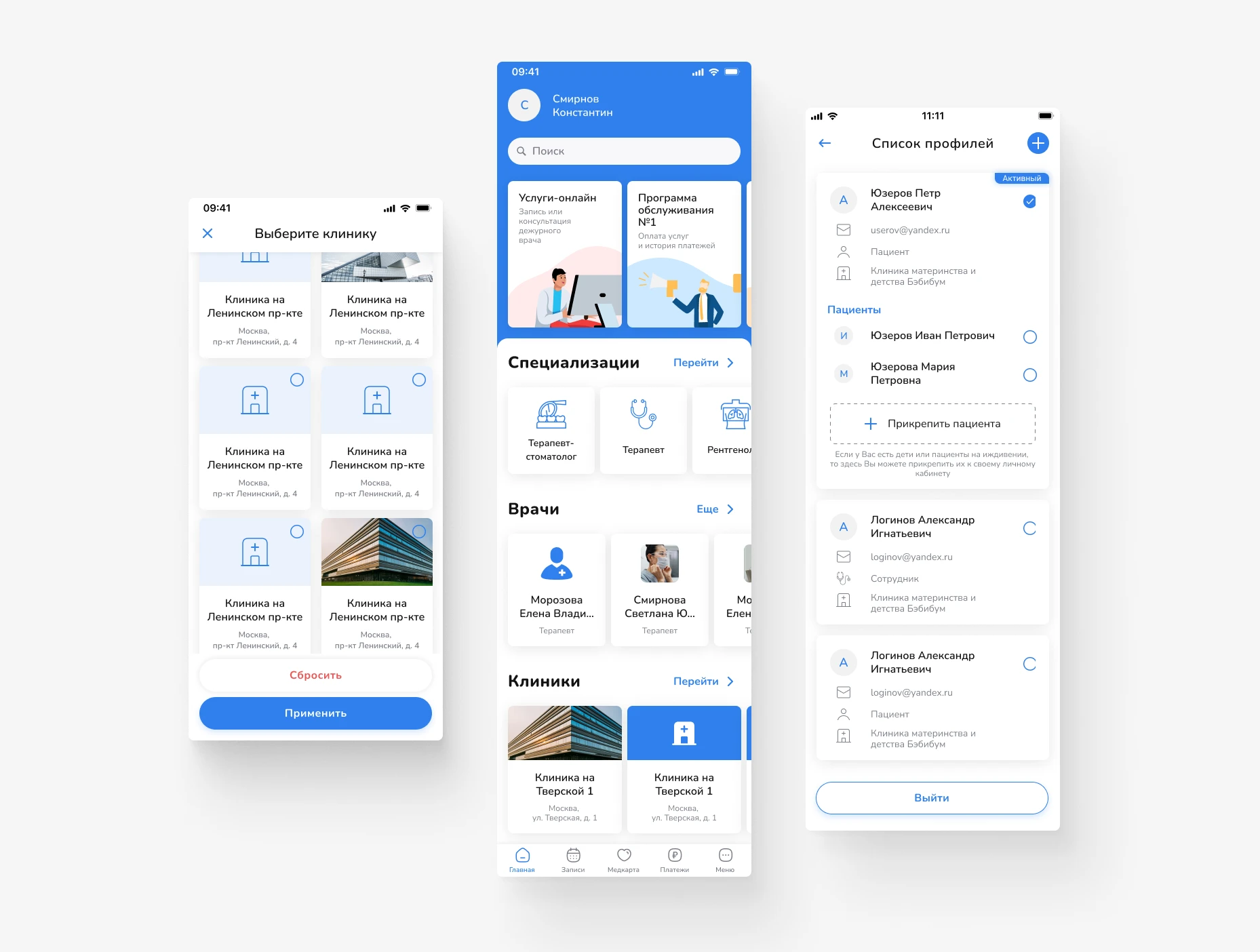
Design of a mobile app for scheduling doctor appointments and managing medical services. Focus on a simple user journey, intuitive navigation, and quick access to necessary actions.
Primo RPA orchestrator’s web dashboard: projects, deployment, and monitoring of RPA robots. Redesign of key screens for production without interrupting releases.
Product concept for a service to create, assign, and track tasks, with an emphasis on process transparency and seamless teamwork.
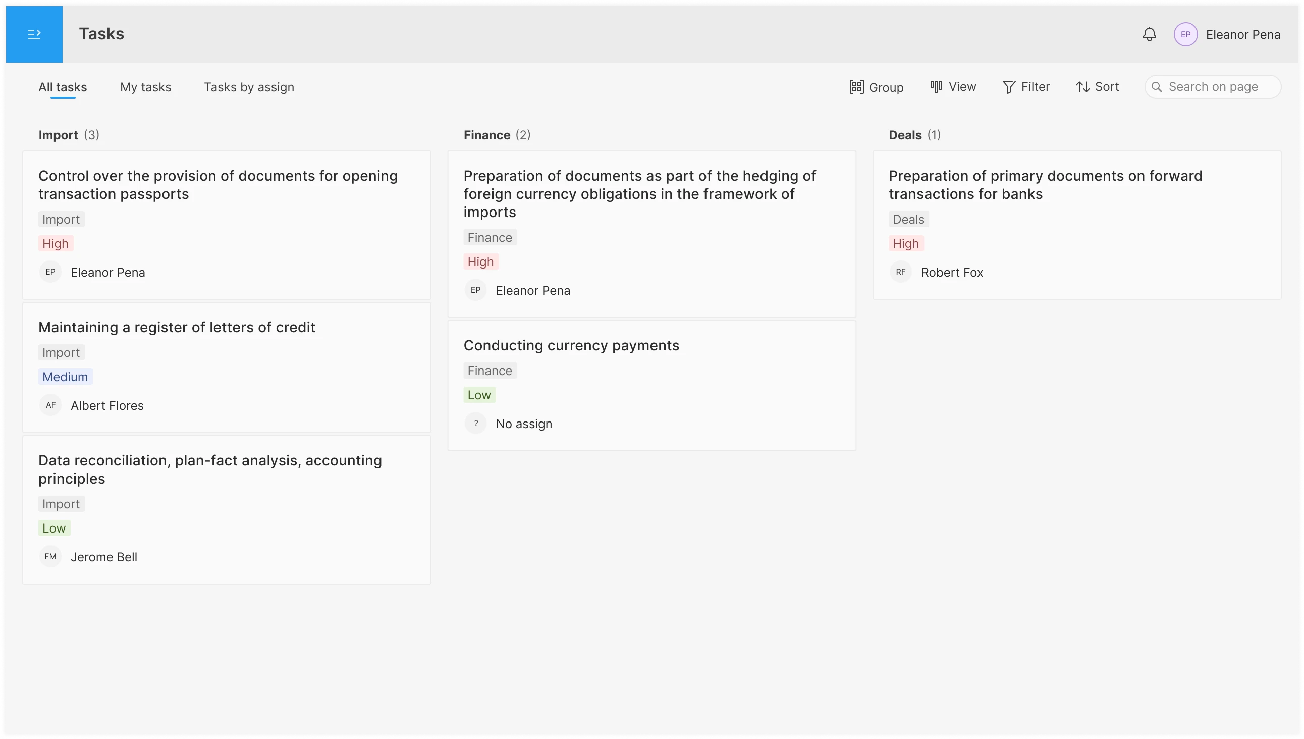
An interface for planning and assigning tasks in the operations department: shared pool, personal to-do list, overview by assignee; tabs, filters, board/list/table views, and drag-and-drop functionality.


