Web panel for automation orchestration
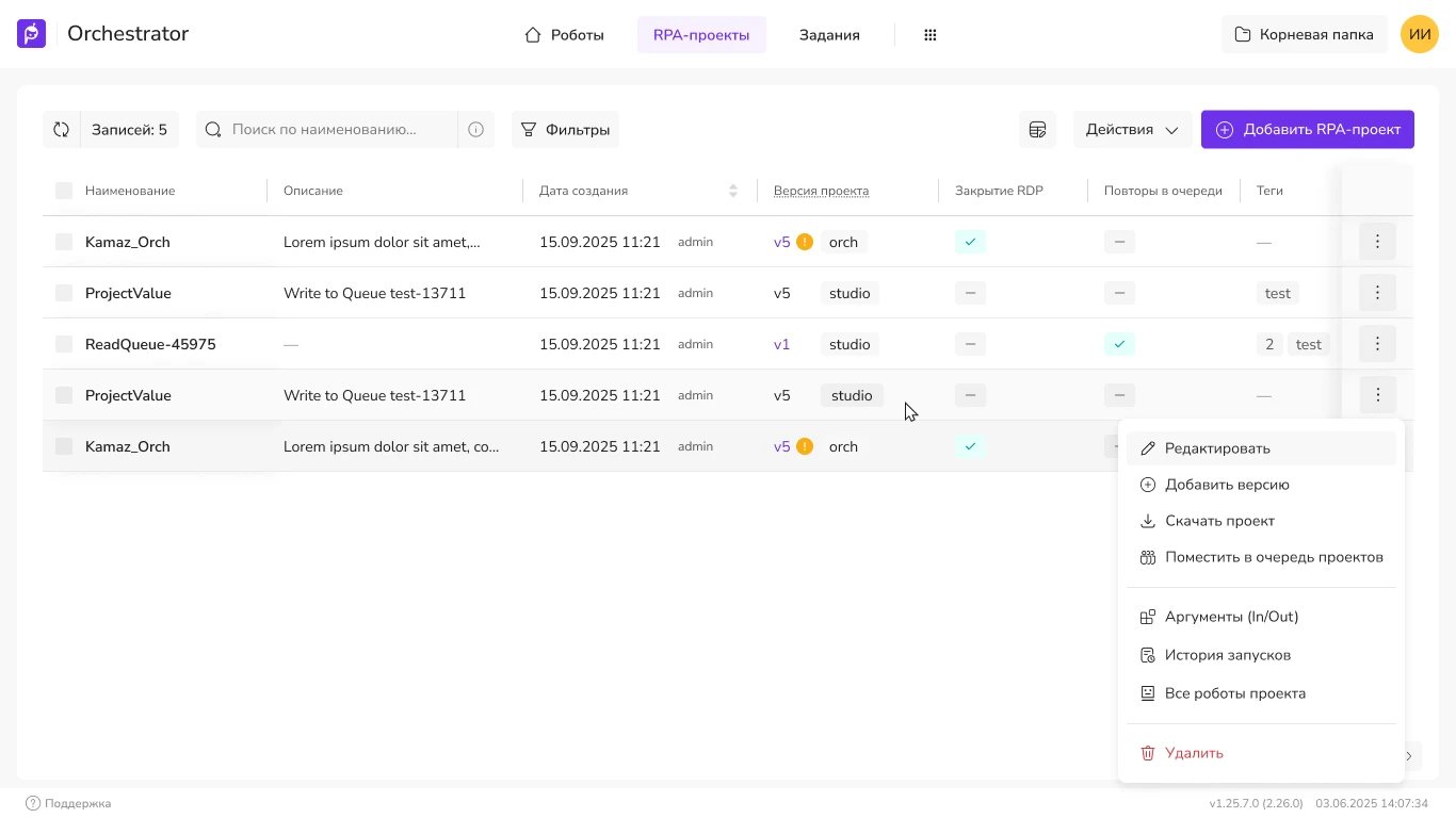
Primo RPA orchestrator web console: projects, launch and control of RPA bots. Redesign of key screens for production without halting releases.
Product Design · AI
Intelligent document
processing platform
and AI agent orchestration
The AI Server product is deployed on clients’ internal servers. It enables the use of neural networks within the company’s internal network and is configured via a web interface.
I was invited to join the project as a UX/UI designer. The product was in the active testing phase; feedback from customers made it clear that the configuration was too complex: only experts and the Primo RPA implementation team could handle it. The complex configuration reduced the product’s appeal and hindered scaling.
My task was to simplify the configuration process and lower the barrier to entry, thereby reducing the workload on technical support and the implementation team—so that customers could configure the service themselves to meet their specific needs.
Below is an in-depth look at the product, examples of completed tasks, and interface patterns.
I began by getting to know the team: who was responsible for the product, who was responsible for implementation, and how everything was currently organized. I spoke with configuration experts, categorized key and secondary scenarios, and compiled a visualization of user behavior. I worked closely with the development team to identify areas where the interface could be simplified and the setup process accelerated.
The product was already in use by customers, so we couldn’t halt development and completely rebuild the interface. I had to decide in what order and which parts to address in the redesign. I incorporated the most significant changes into the current development plan without disrupting the release schedule.
I had to plan the interface changes with the framework in mind. At the time, it was Ant Design on top of React, styled after Hope UI.
I only had to create new components as a last resort; the priority was to reuse the existing library. This is evident in the final screens: the interface is mostly built from ready-made blocks, rather than from scratch.
Interface elements that I redesigned or built almost from scratch. Below are individual tasks from the project that I wanted to showcase in my portfolio—not an overview of the entire product.
The service used a layout common for admin panels: a side menu on the left and content on the right. The screenshot shows that this page structure didn’t make effective use of the available screen space. When you open the project, the navigation for the project sections appears on the left—intermixed with the main navigation—which confuses the user. This situation needed to be fixed.
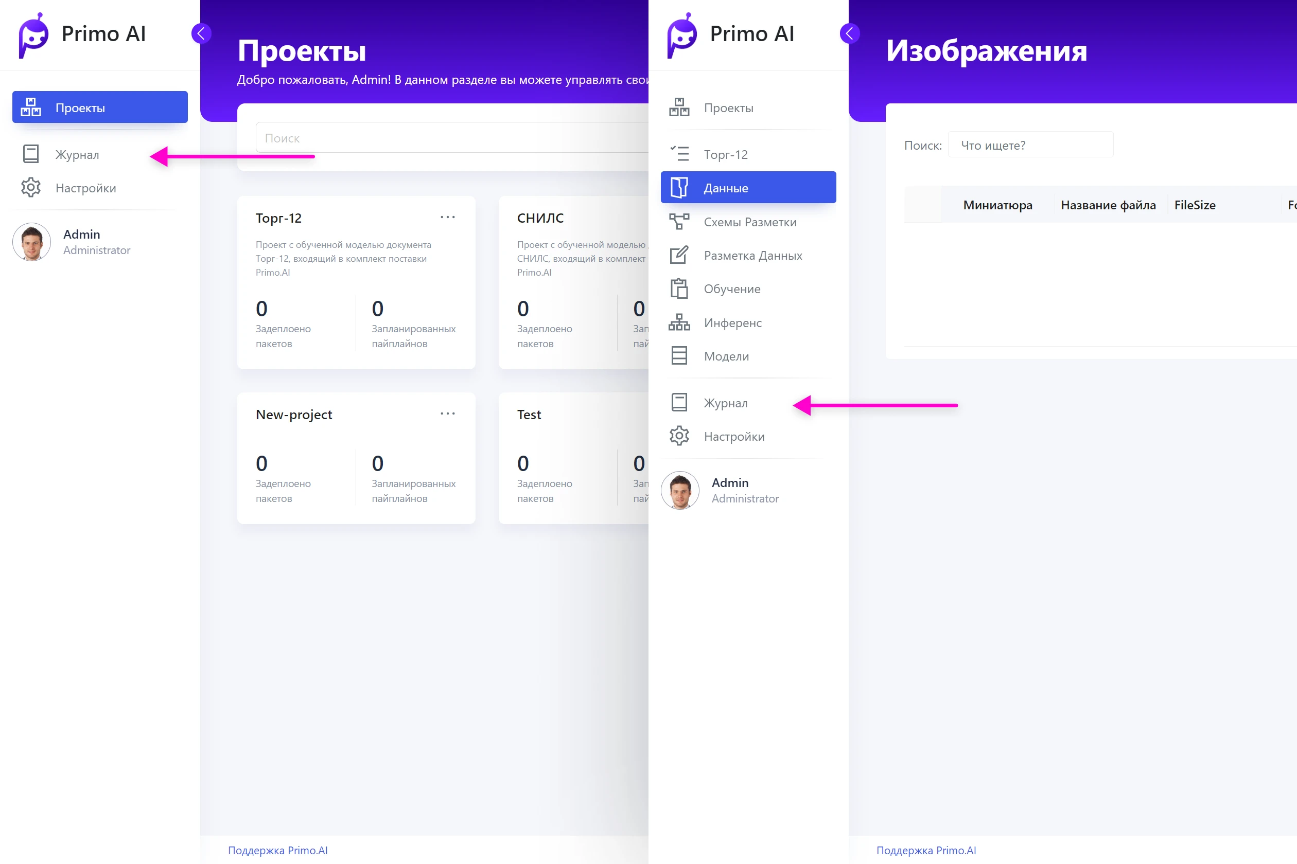
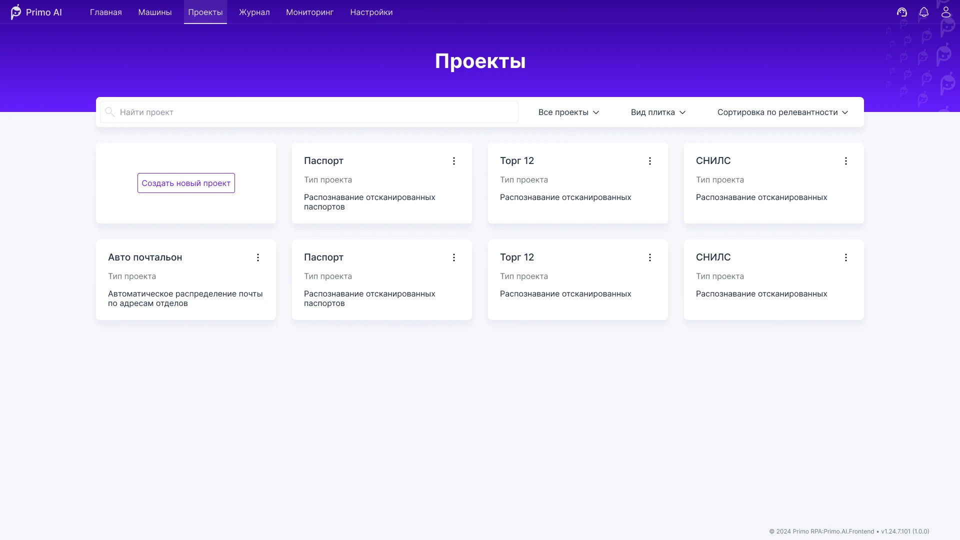
The updated navigation is now more compact and remains familiar to most users. There is significantly more space for content. As you’ll see later, projects will have their own separate navigation that won’t overlap with the main navigation. At the same time, the service’s overall aesthetic has improved.
Users retain access to both the navigation within a project and the service’s main navigation. Different project types contain varying numbers of items, and this solution allows for their optimal placement.


I’d like to highlight the design of the navigation items. Visually, it subtly suggests that it’s more convenient to go through the setup step by step, but the sections still function as regular tabs: you can switch between them in any order.

This is the screen where users spend the most time. Annotating fields across hundreds of images is monotonous work, but the quality of the data used to train the model depends on it. The previous editor stood out sharply from the service’s overall style: it looked cluttered and was confusing in places, especially when working with fields.
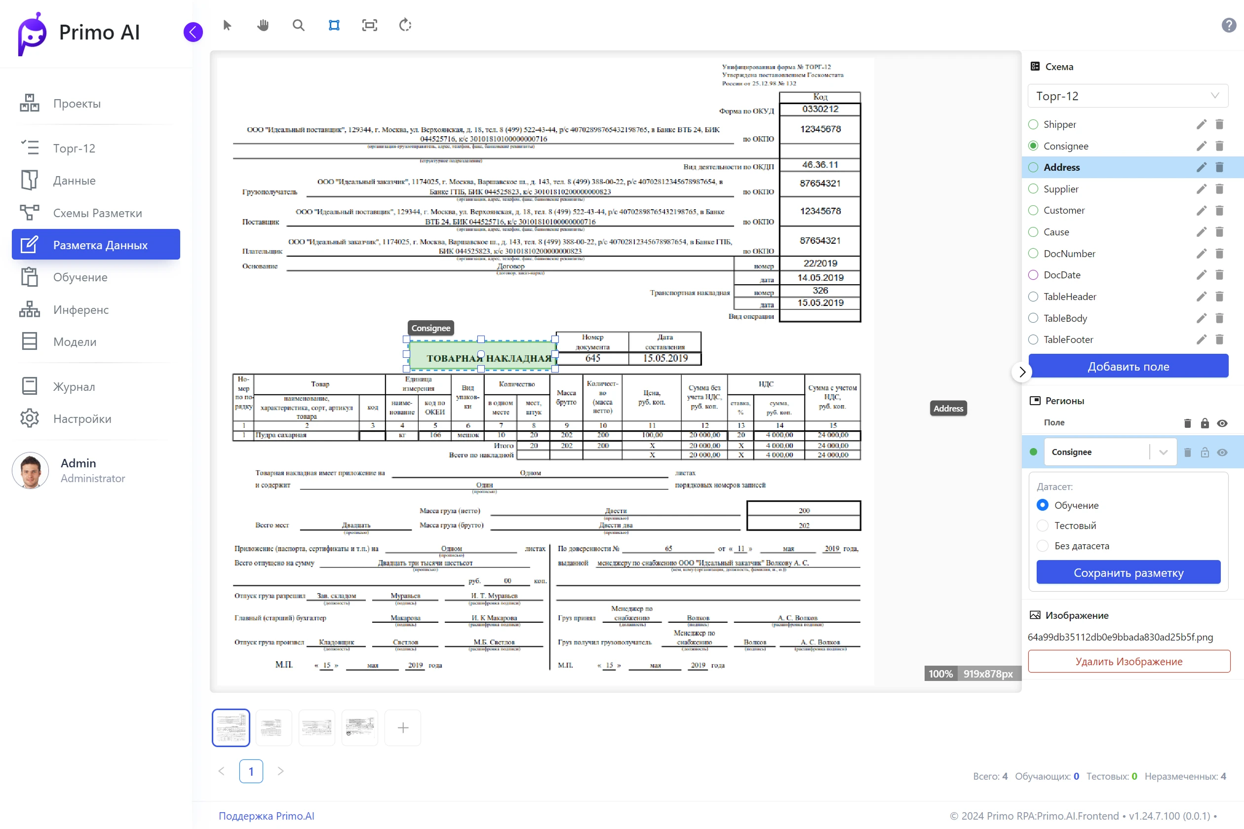
I broke down the editor into microscenarios, organized them by priority and how they relate to each other. The team and I discussed how to make the user experience smoother and more intuitive. In the new page structure, I reserved space for new functionality and incorporated the same design patterns used throughout the rest of the service. The editor’s design now aligns with the overall style.
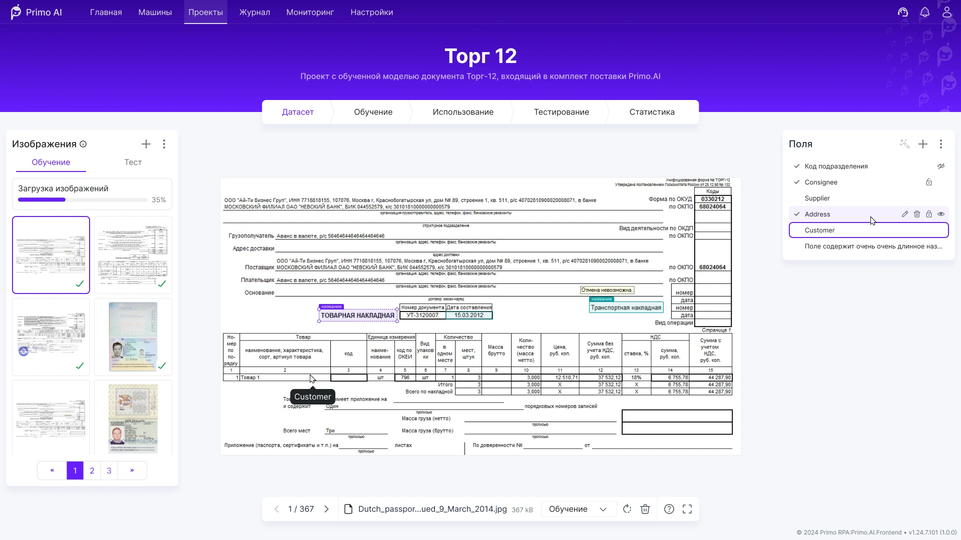
The schematic sketch shows that the page has become symmetrical: almost all the space is devoted to the image being marked up. Actions are grouped by panels—making it easier to find the desired function.

Added a “Full Screen” mode. Advanced users usually hide unnecessary panels and work with markup using keyboard shortcuts and the bottom panel. The side panels can be collapsed when more space is needed for the image—this is especially important on smaller monitors.
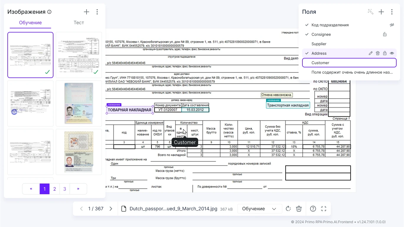
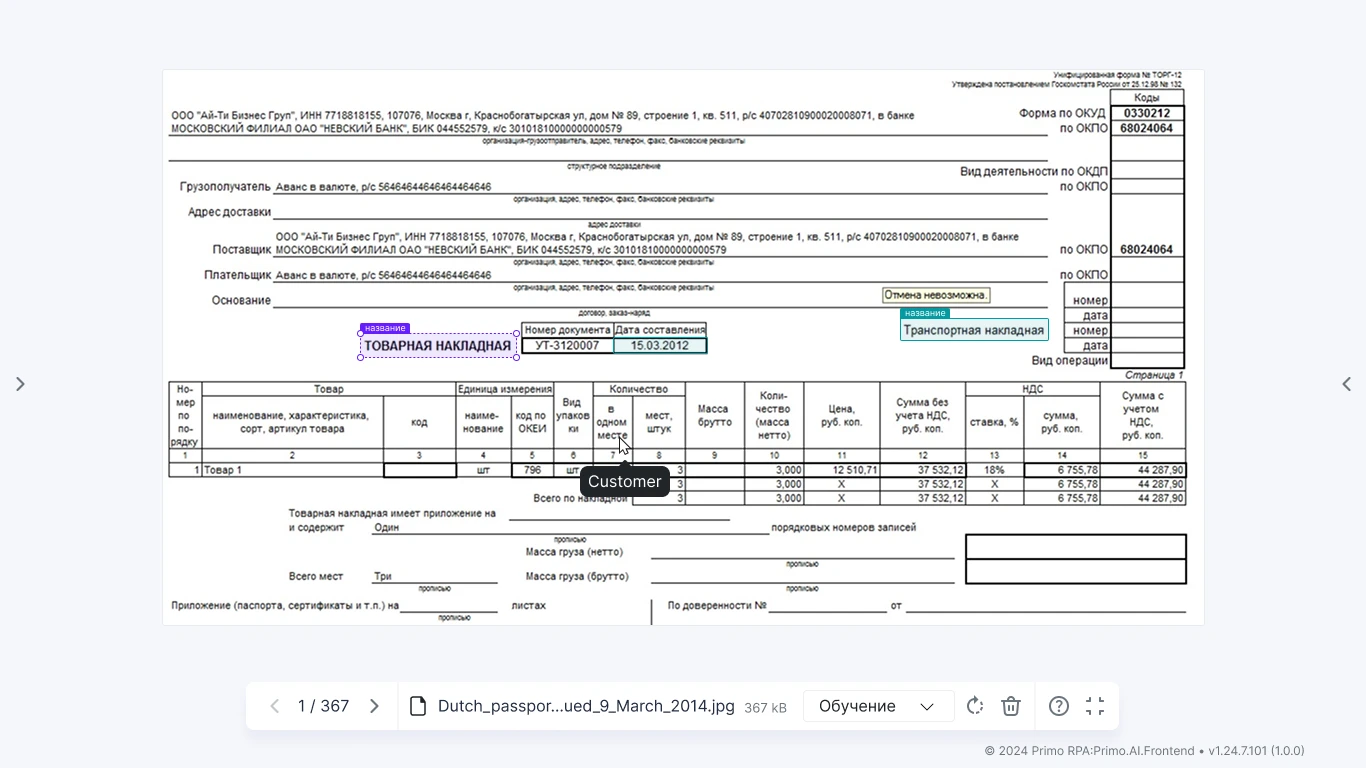




The bottom toolbar lets you switch between images and perform quick actions.

After labeling the dataset, the model can be fine-tuned. As usual, our team broke down all user actions for this task. We created several layout options for this page; the one with a card feed turned out to be the most successful.
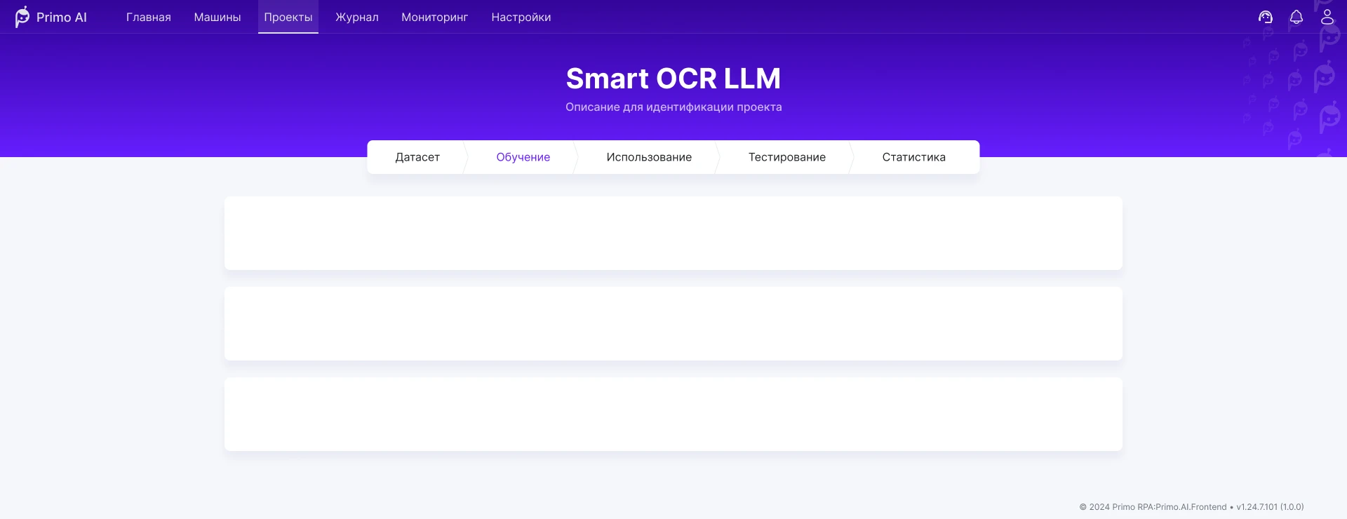
At the top of the feed, the user sees a training configuration card: it displays the annotation results for the active dataset, allows the user to set parameters, and initiates fine-tuning.
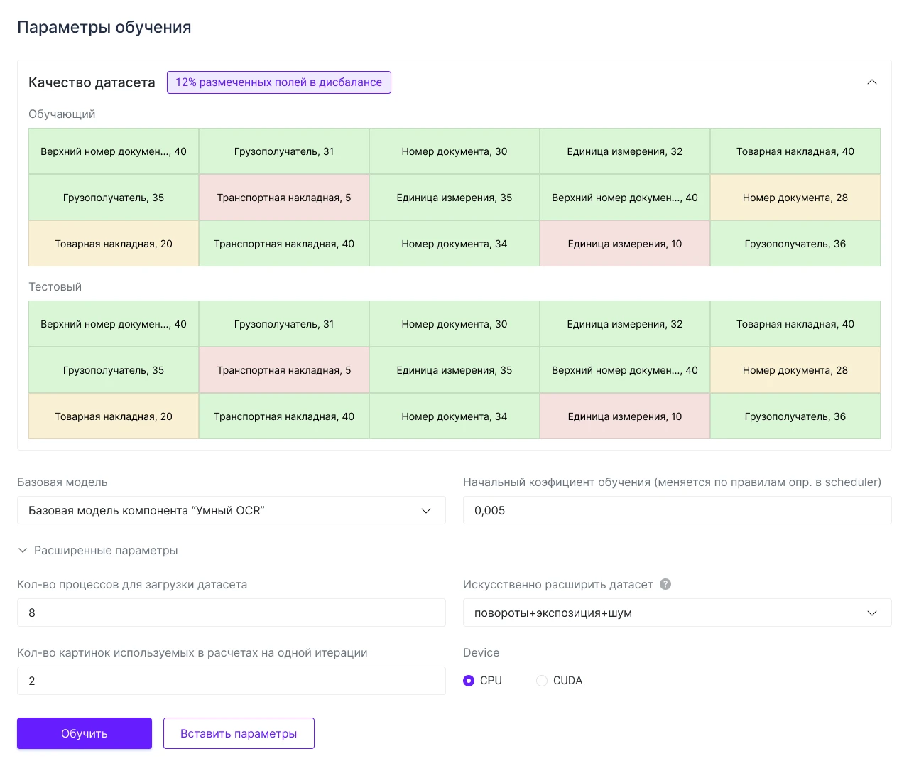
The card includes a separate section with an assessment of the dataset’s annotation quality and a section with parameters to configure before starting training.
A separate card will appear below for each process that is started. You can run multiple processes with different parameters and then compare which configuration performed better.
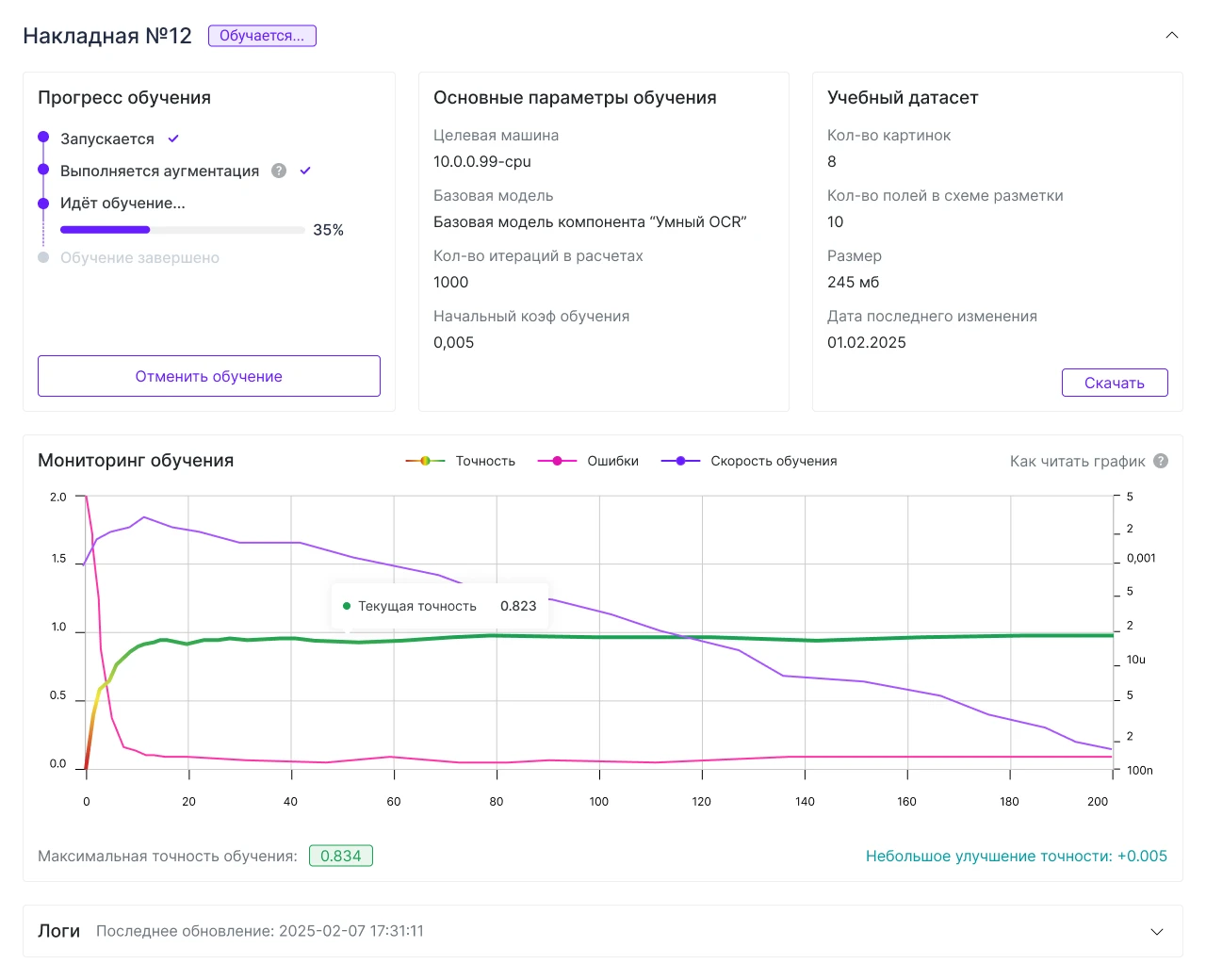
Within the card, information and actions are organized into logical blocks. We considered various layout options and ultimately settled on a scheme that proved to be more user-friendly than the others.
The cards can be collapsed. For convenience, the name and status are displayed in the header.

After refining these cards, we identified patterns that were later used in other sections of the product. This makes it easier to maintain a consistent style across the interface.
On one of the pages in the project section, we needed to allow users to configure unique field parameters for a dataset. The editor required a large area for an image (a scanned document), and there could be dozens of fields, each with its own dependent parameters and types.
The video shows the prototype of the finished solution in action.
The interface turned out to be compact and clean. The mechanics aren’t immediately obvious, but after a brief learning curve, users find it comfortable to use.
Developing the editor proved to be an interesting and challenging task for me: there were many drafts and different behavior options. In the end, we settled on a version that met all the requirements my team and I had defined.
In the service, some tasks need to be performed alongside other work. For such scenarios, we implemented the following: a modal window opens on a separate page.
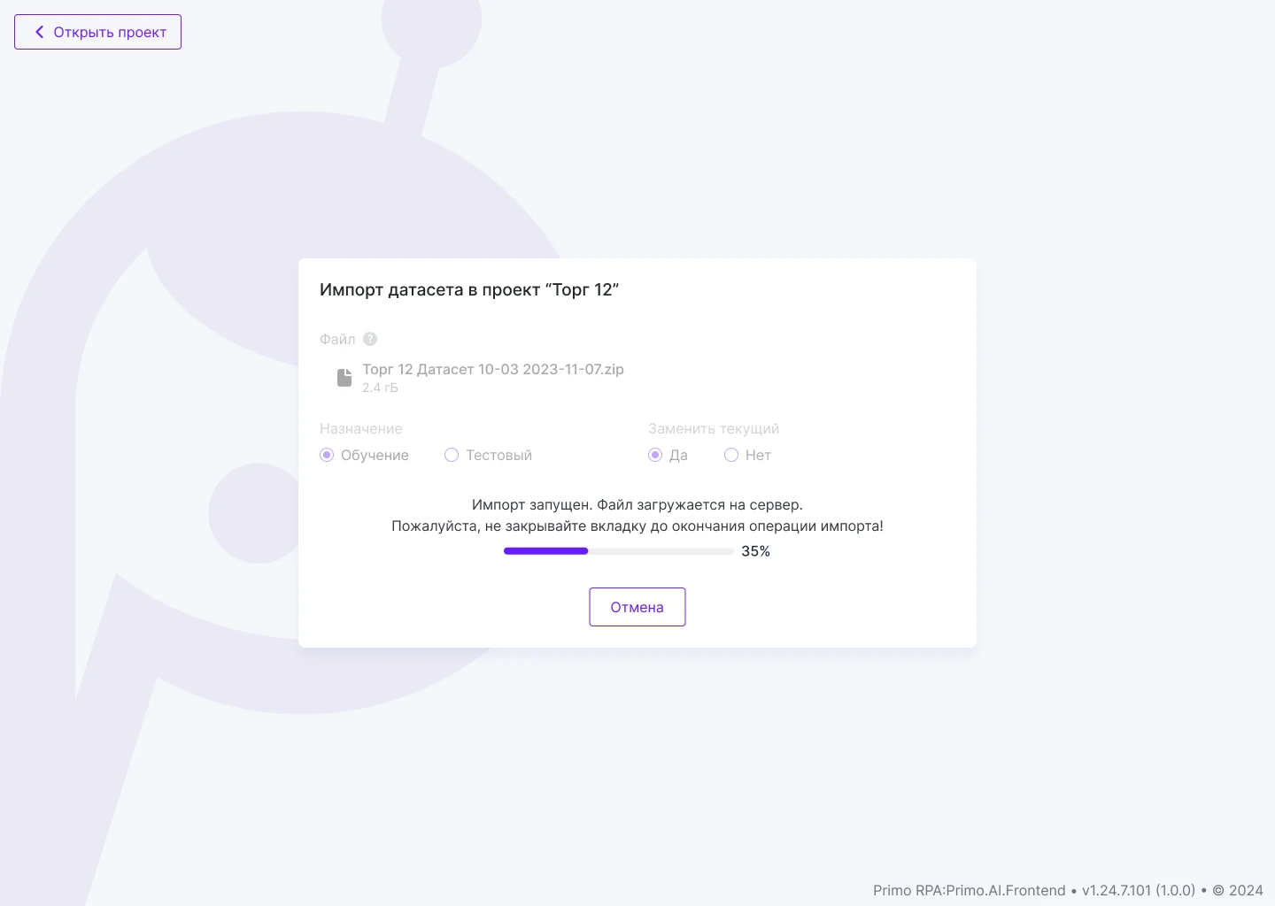
A placeholder is displayed on the project page: the process is in progress, with a button next to it to navigate to it.
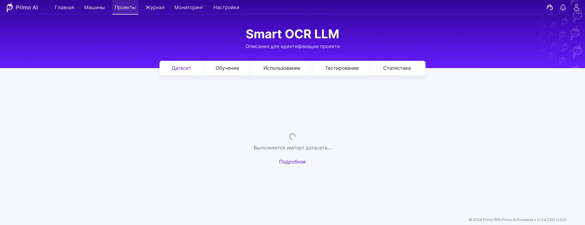
These placeholders appear in several sections of the project—depending on whether you can work with that section while the task is active.
This approach turned out to be technically simpler than selectively disabling buttons on individual pages.
Once a week, the team met to discuss the design. The calls were long but productive. We created a weekly list of design tasks, adjusting priorities and deadlines to align with release plans.
I created the designs in Figma and sent links to the finished user flows to the development team. We didn’t set up a separate design system or UI kit—the product already had a ready-made framework.
From time to time, I would have one-on-one calls with the front-end developer to clarify details about the mockups or explain how the interface should behave. After the layout was completed, I provided feedback on revisions to ensure the result matched the intended behavior and appearance of the interface.
I managed this project alongside others, so I had to balance my workload. The company hired a new designer—my task was to bring her up to speed and oversee the results of her work on each task. Once she was up to speed, responsibility for the project shifted entirely to her.
The Primo RPA AI Server interface now has a consistent look and feel. It is user-friendly even for those who are not yet experts in AI. The interface is designed to accommodate future changes, allowing for the addition of new features without major overhauls.
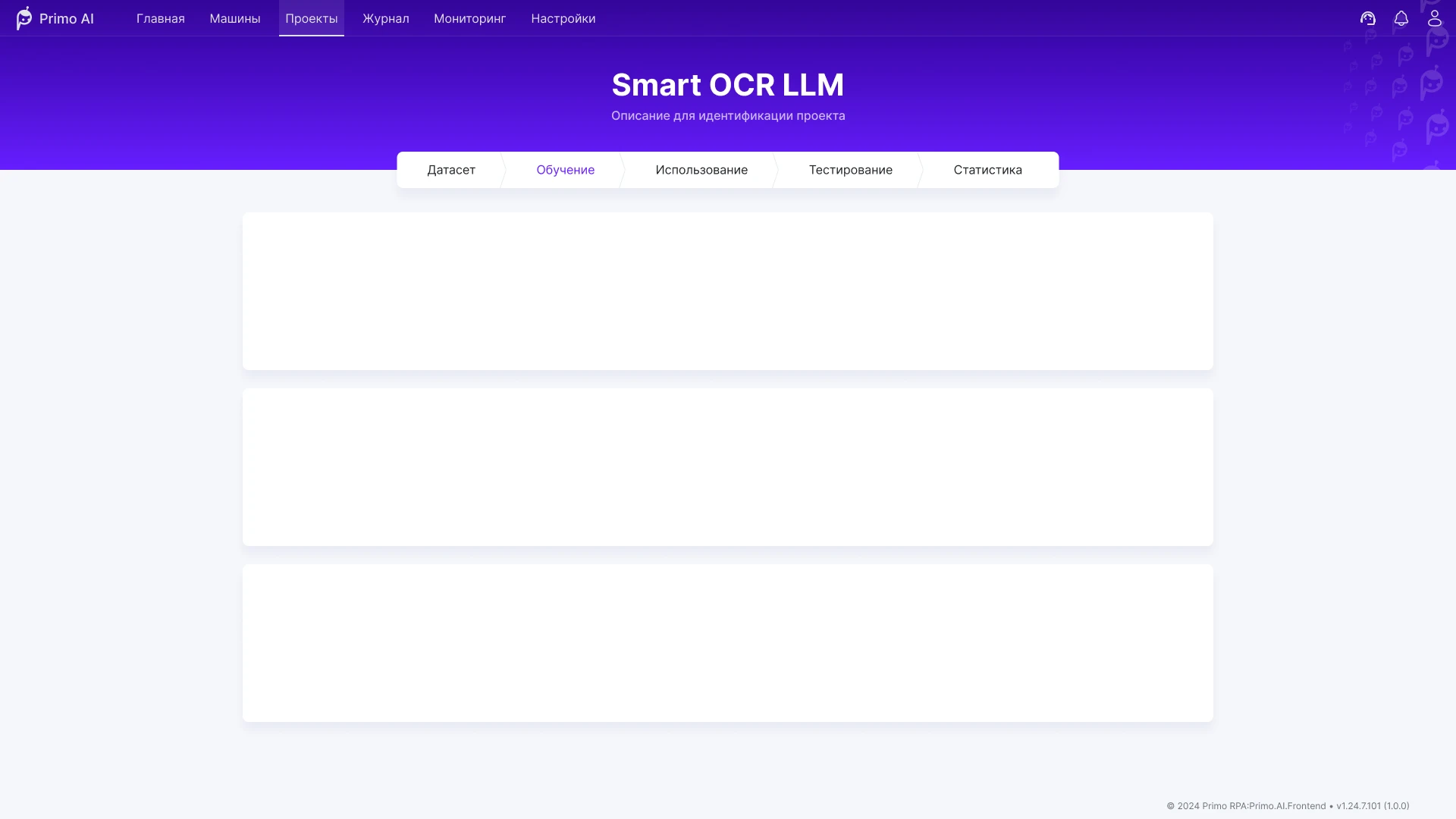
An interface for training and using AI models in business processes: working with data, automation scenarios, and Smart OCR.
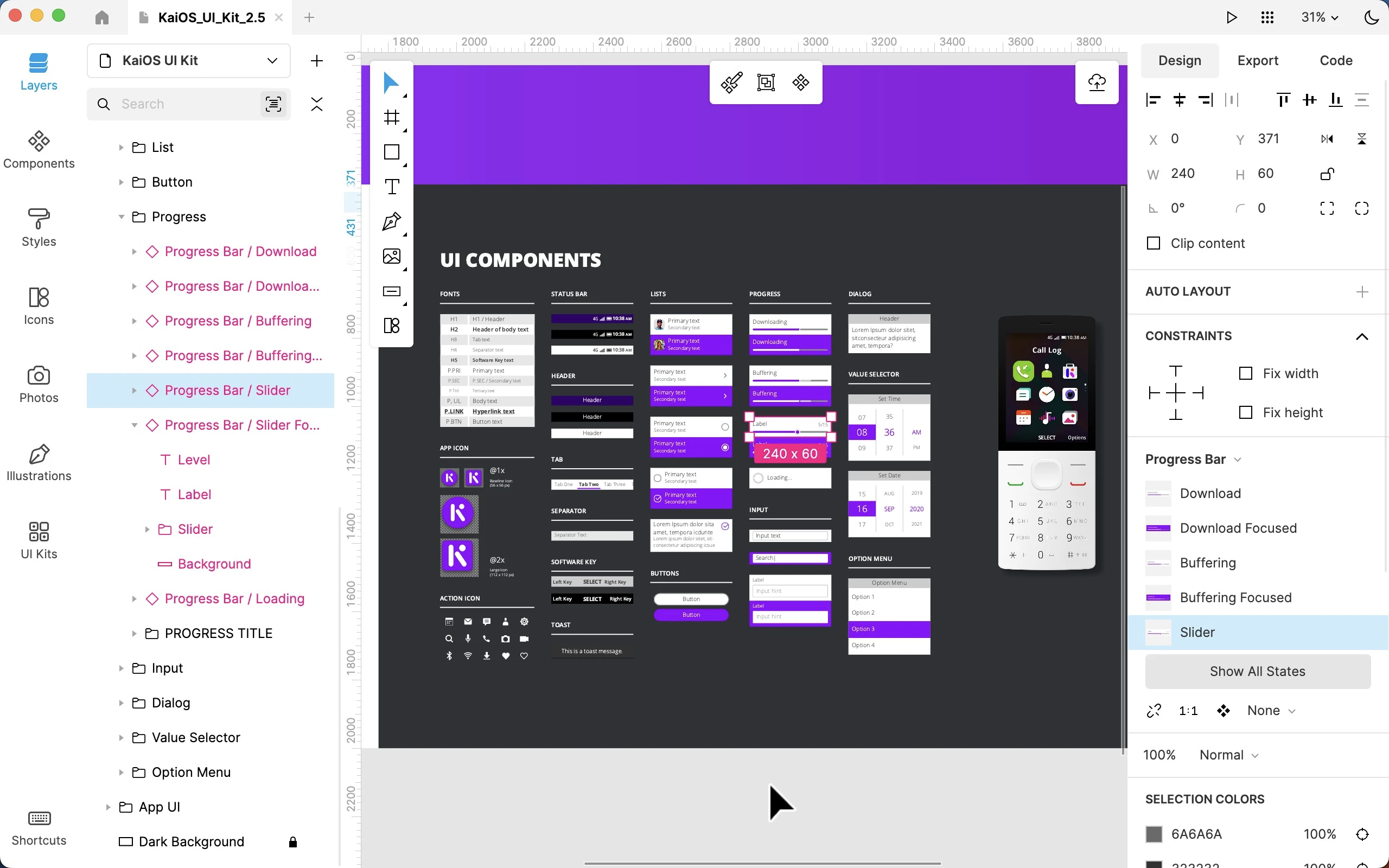
Worked on the Lunacy interface as part of the Icons8 team: user flow, complex prototypes, and improvements to functionality and interface logic.
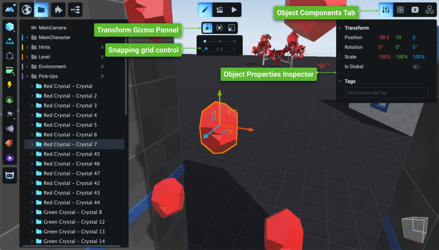
Redesign and development of the game engine’s user interface: a new operational concept, an updated visual system, and the development of hundreds of complex user scenarios.
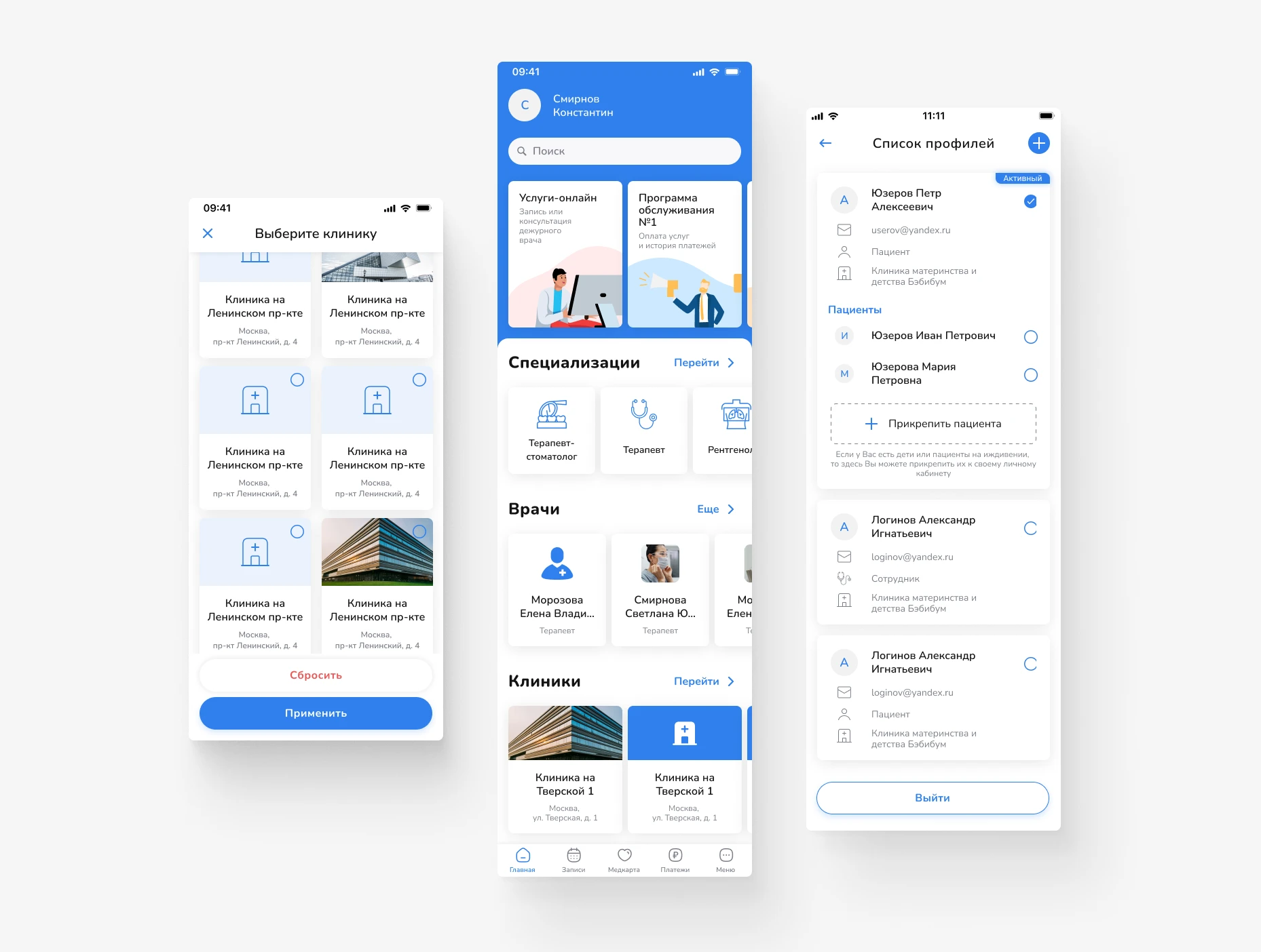
Design of a mobile app for scheduling doctor appointments and managing medical services. Focus on a simple user journey, intuitive navigation, and quick access to necessary actions.
Primo RPA orchestrator’s web dashboard: projects, deployment, and monitoring of RPA robots. Redesign of key screens for production without interrupting releases.
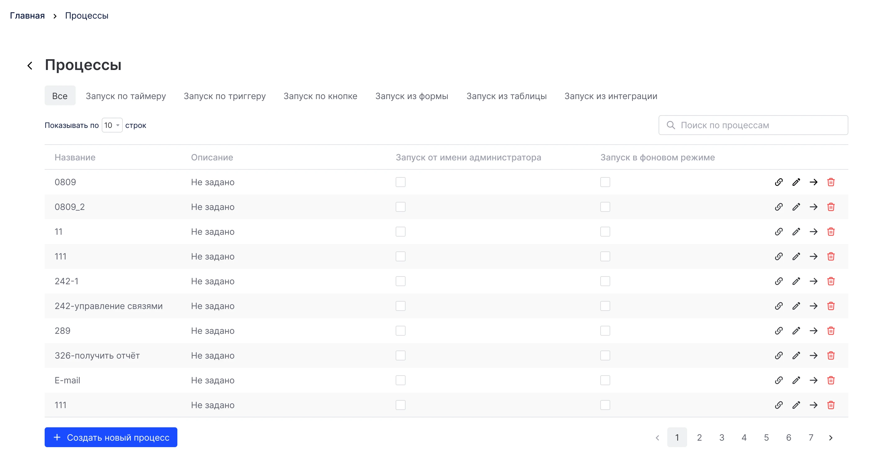
Product concept for a service to create, assign, and track tasks, with an emphasis on process transparency and seamless teamwork.
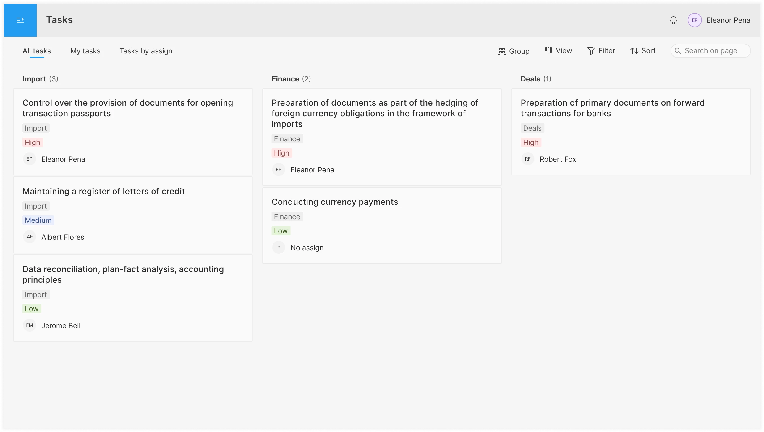
An interface for planning and assigning tasks in the operations department: shared pool, personal to-do list, overview by assignee; tabs, filters, board/list/table views, and drag-and-drop functionality.


