Web panel for automation orchestration
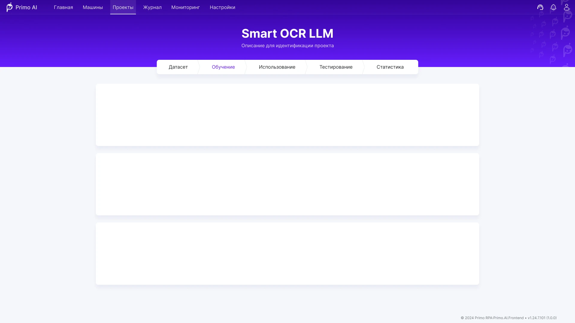
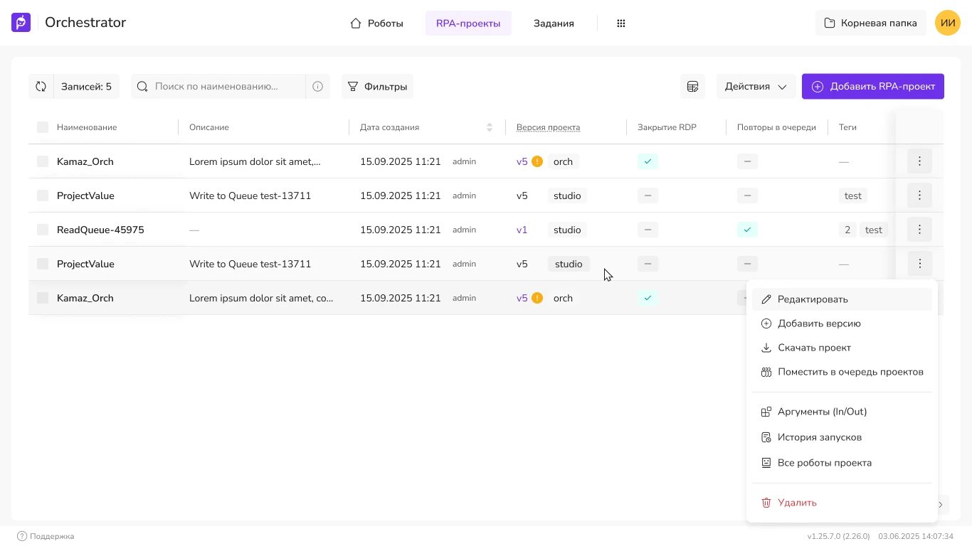
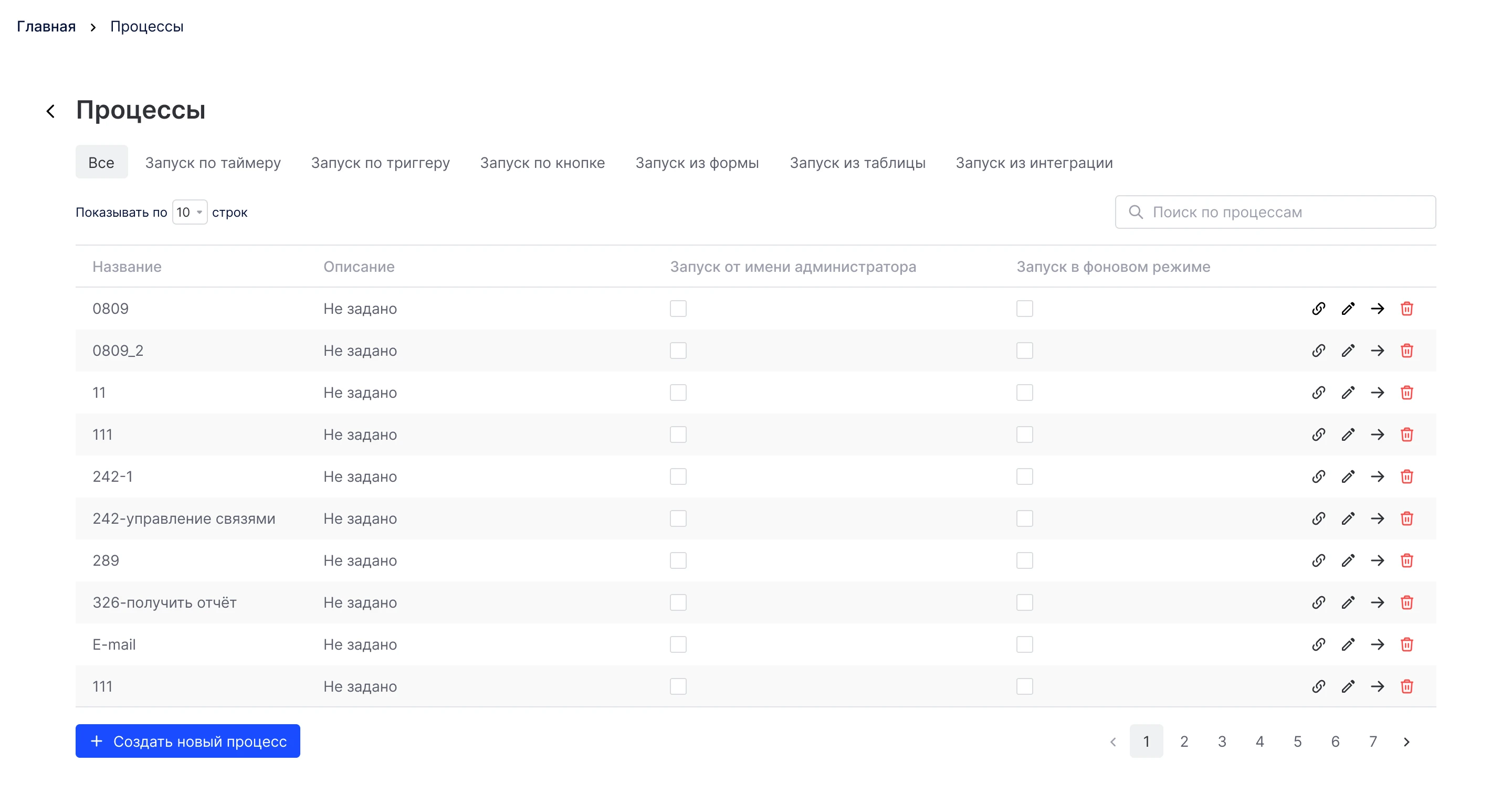
Primo RPA orchestrator web console: projects, launch and control of RPA bots. Redesign of key screens for production without halting releases.
Demo · template
Text blocks and elements for quickly building a longread
The media for the demo is located in public/assets/ (the page builder does not copy them). See public/assets/README.md.
This section shows an example of a text block for the introduction. Here, you can briefly describe the product, the audience, and the project’s limitations. The text is neutral: the goal is to quickly sketch out the structure and check the page’s visual rhythm.
We need to put together a demo longread with the main UI elements: link cards, media blocks, and examples of content layout. It’s also important to check how the blocks behave on narrow and wide screens.
Below are some ready-made examples that you can copy into real-world projects.


Block data-case-tall-media: width is specified by the data-case-tall-width="wide" (like a “wide” image) or content (per column). When collapsed, the top part of the frame is visible; at the bottom of the preview, there’s a solid “fog.” An “Expand” / “Collapse” button with a chevron icon appears above the bottom of the frame, inside the border; when expanded, the fog disappears; when collapsed, the page scrolls back to the preview. The preview height is set .case-media-tall__clip via --case-tall-max (default min(70vh, 32rem)).
img-long.webp (source PNG next to it in public/assets/template-elements-demo/).
The number of columns on a wide screen is set via figure: the style="--case-gallery-cols: 3". Below these thresholds, the grid collapses to two or one column. Clicking on a thumbnail opens the general case viewer.







The case-media-gallery--wide — same logic for extending beyond a column as in the single-column case-media--wide. Here, there are four columns on a wide screen (--case-gallery-cols: 4).
Block .case-media-slider displays slides one at a time: navigation using “prev/next” arrows,
paging using dots (the active one is highlighted in accent color). Keyboard support (←/→, Home/End on dots),
touch/mouse swipe, and lazy loading of adjacent frames via data-src. Clicking on the active
slide opens the general case viewer.




The same slider, but with the modifier case-media--wide — extends beyond the content column,
like single wide images. The previous/next buttons and dots behave the same way.







Slider with horizontal (wide) frames of the same size—all images
1024×800.
The same slider, but with vertical frames of the same size—all images
600×800.






A separate example: a toggle for the frame-switching animation mode—
slide (slide), fade (crossfade), and none (no transition).
The mode is set by the attribute data-slider-anim on the shape.
The template is ready to be copied into a new case study: all that’s left is to replace the fish with the actual text and insert the project’s real links and media.
Interface for training and using AI models in business processes: data work, automation scenarios, and Smart OCR.
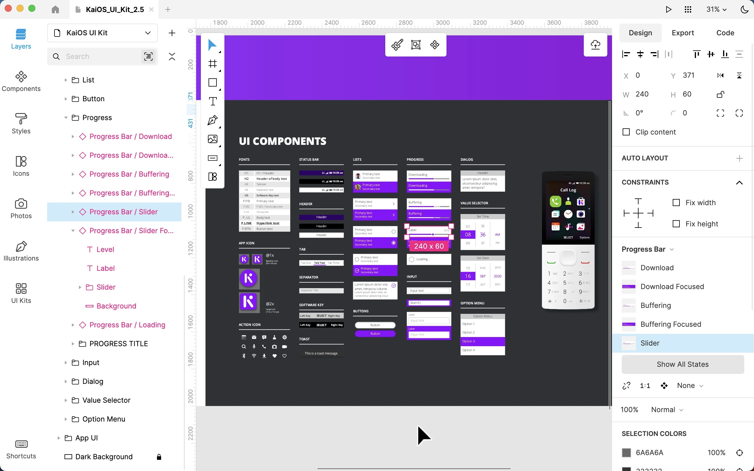
Work on the Lunacy interface at Icons8: user flows, complex prototypes, improved functionality and interface logic.
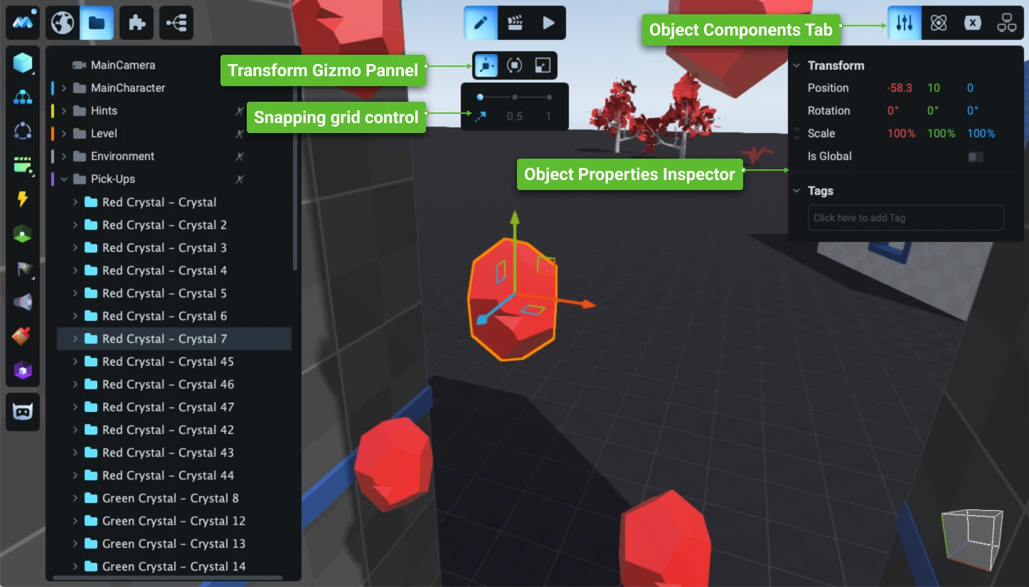
Redesign and evolution of the game engine interface: a new working concept, refreshed visual system, and hundreds of complex user scenarios worked through.
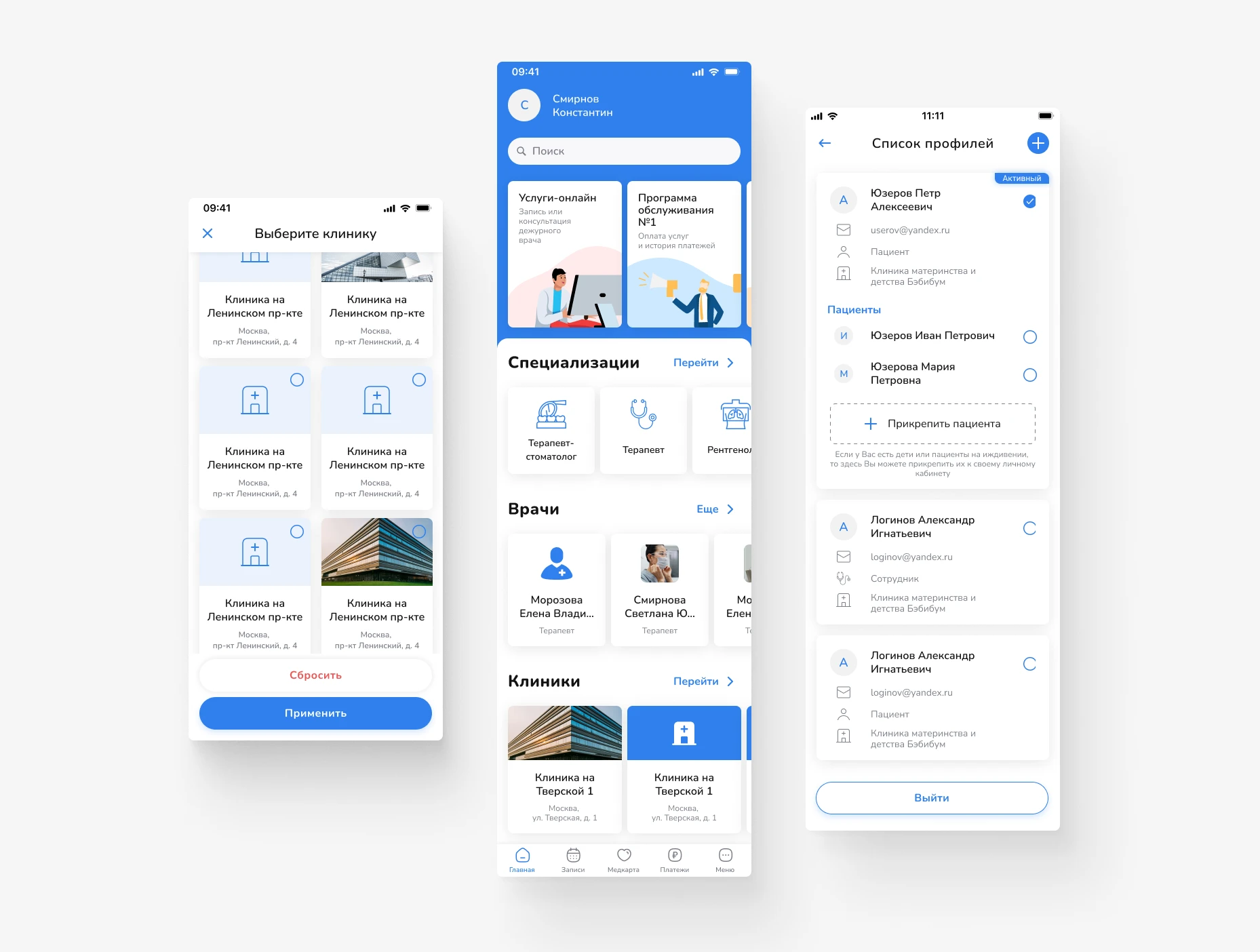
Design of a mobile app for booking doctors and managing medical services. Focus on a simple user path, clear navigation, and quick access to the right actions.
Primo RPA orchestrator web console: projects, launch and control of RPA bots. Redesign of key screens for production without halting releases.
A product concept for a service to set, distribute and track tasks, with emphasis on process transparency and comfortable teamwork.
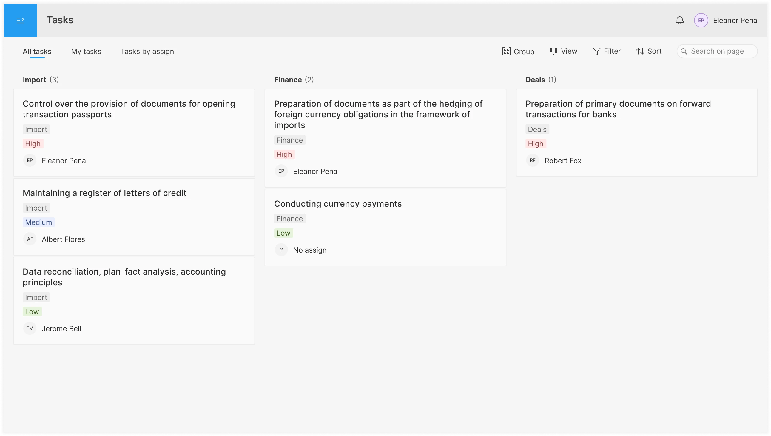
Interface for planning and distributing tasks in the operations department: shared pool, personal ToDo, per-assignee overview; tabs, filters, board / list / table views, drag & drop.


